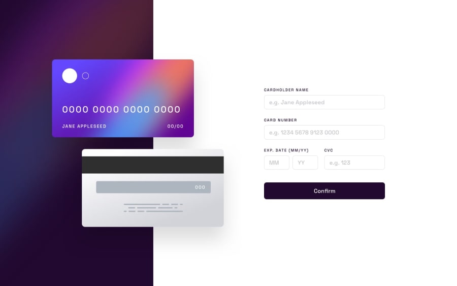
Design comparison
SolutionDesign
Solution retrospective
Hi there! Just finished this project, feel free to leave me any recommendations or feedback :) Thanks
Community feedback
- @hmadamkPosted about 2 years ago
- consider making the button more interactive like so
button{ cursor:pointer } button:hover{ opacity:0.8; }- non-sighted user can't really link your text with the inputs so to help them understand what this input is for consider adding aria-label like so
<input aria-label="Enter your name" >or
<label> cardholder name <input> </label>- your html is missing alot of head tags I would suggest you use the html presented by the challenge starter file
- you should read the report for html and accessibility
Marked as helpful1
Please log in to post a comment
Log in with GitHubJoin our Discord community
Join thousands of Frontend Mentor community members taking the challenges, sharing resources, helping each other, and chatting about all things front-end!
Join our Discord
