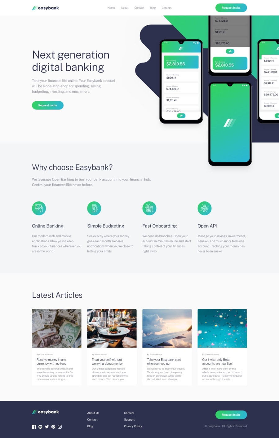
Design comparison
SolutionDesign
Community feedback
- @Code-BeakerPosted 3 months ago
Hi there, congratulations on completing this project... You've done a great work on this one! 🎉
I want to share some of my recommendations on improving your solution that I found while checking your live site and source code.
- Store your assets inside a folder. When I visited your GitHub repository, I noticed that you had stored the images as well as the code files in the root directory itself. Instead, move the images into a separate folder for example,
images/ | - image1.jpg | - image2.jpg | - image3.jpg- Use appropriate tags for your components. Heading levels should decrease by one as it is an important factor in improving the accessibility of the page.
h1 h2 h3 ... ... ...- In the footer, you have used the
spantag to create the links. They are hyperlinks and should be created with theatag. - Instead of
px, use relative units likerem. Note thatfont-sizeshould never be defined inpx. Here's an article that explains the topic. You can useremfor the following properties and more.- margin
- padding
- font-size
This will make it easier to make the page responsive.
Overall, it looks good. You have done a good job with the responsiveness on mobile.
Hope you find these helpful! 😄
0
Please log in to post a comment
Log in with GitHubJoin our Discord community
Join thousands of Frontend Mentor community members taking the challenges, sharing resources, helping each other, and chatting about all things front-end!
Join our Discord
