Submitted 6 months ago
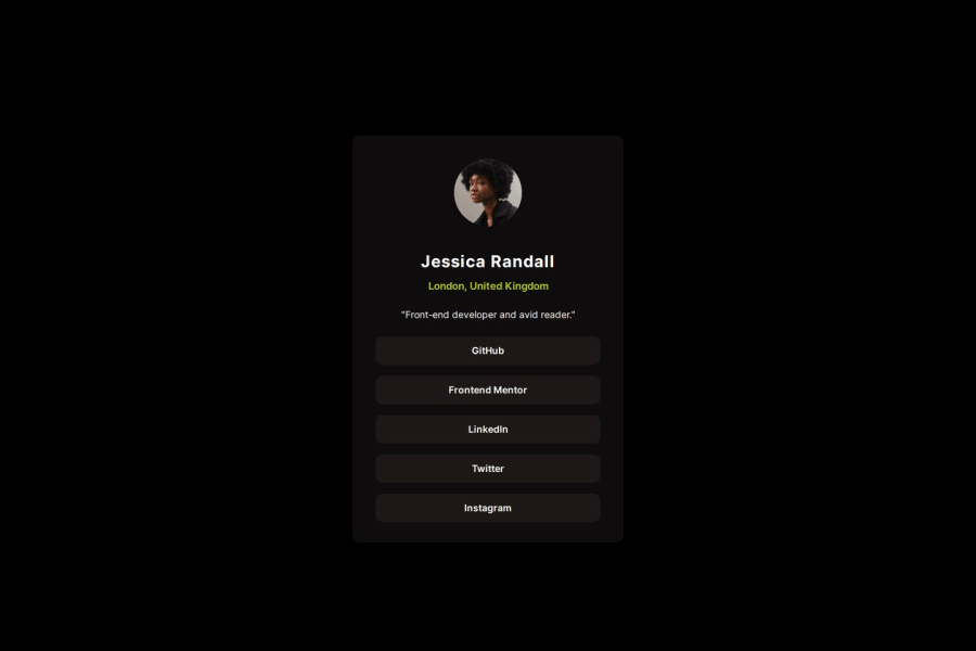
bam blocks, adaptive layout, flex boxes
@KristinaHorbenko
Design comparison
SolutionDesign
Community feedback
- P@marcus-hillPosted 6 months ago
Great job Kristina, your preview matches the design files perfectly and I think the flexbox use was a great way to do it. However, at 375px (mobile size) the social card is very squashed. Perhaps a media query could solve this? Keep up the good work!!
0
Please log in to post a comment
Log in with GitHubJoin our Discord community
Join thousands of Frontend Mentor community members taking the challenges, sharing resources, helping each other, and chatting about all things front-end!
Join our Discord
