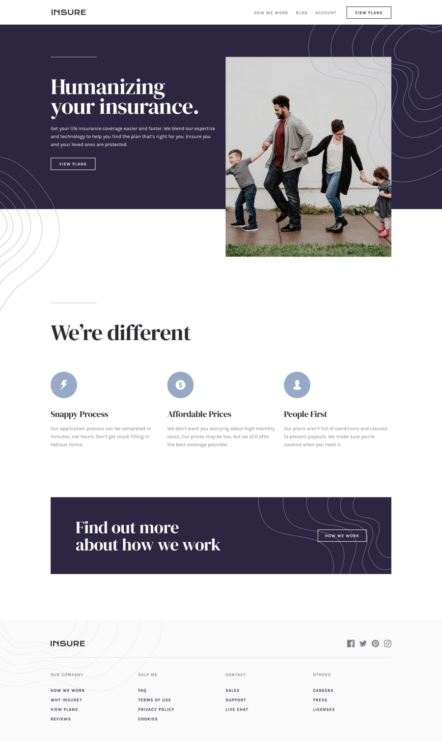
Design comparison
Solution retrospective
Any feedback and comment it's usefull.
Community feedback
- @afrusselPosted over 3 years ago
Mobile view is good. Mobile nav is looking nice
Marked as helpful2 - @MojtabaMosaviPosted over 3 years ago
Well done, take a look at the following things:
1- Semantic markup it's all about choosing the right html element for a specific task, for instance header should be contained inside a h1 not a p tag. Achieving this is always not easy and even sometimes not possible that's when you use the generic element lik div. A example the item in the footer are expected to be link so it would make sense to place them inside a a tag.
2- Add hover state to the social icons in the footer.
Keep coding :=)
1@renatoalmeida49Posted over 3 years ago@MojtabaMosavi Thank you, mate! I will do this
0
Please log in to post a comment
Log in with GitHubJoin our Discord community
Join thousands of Frontend Mentor community members taking the challenges, sharing resources, helping each other, and chatting about all things front-end!
Join our Discord
