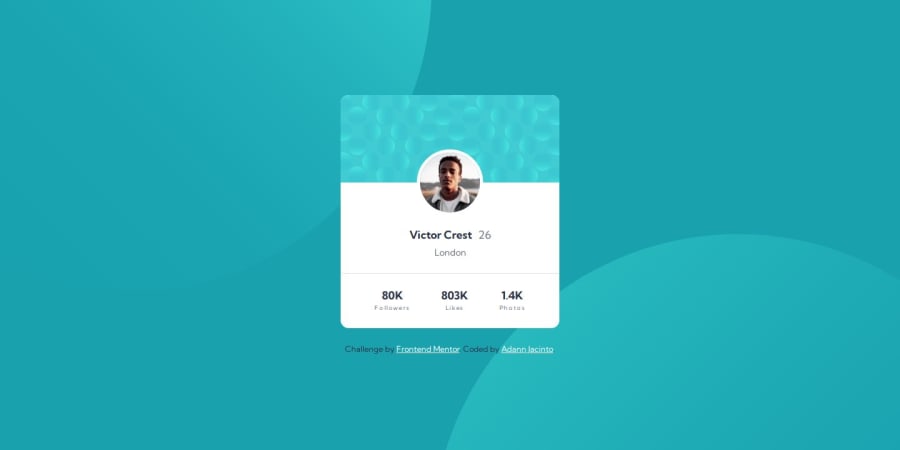
Design comparison
Solution retrospective
This challenge was pretty fun, to be honest. I had to learn how to use 2 images to make a single background that shrinks according to the screen size.
What challenges did you encounter, and how did you overcome them?I wasn't sure what's the best approach for the background to work in this one, so I did what I found fit.
What specific areas of your project would you like help with?I'm open to different ideas on how to handle the background. Although my application worked, I always enjoy learning new ways to solve similar puzzles.
Community feedback
- P@danielmrz-devPosted about 1 year ago
Hello @DanCodeCraft!
Your solution looks great!
The background pattern with the circles is a bit tricky, but you don't need separate containers to create it as it's possible to work with multiple background images at the same time. Here's how you can do it:
📌 Add this to the body:
  background-color: var(--Dark-cyan);
  background-image: url("./images/bg-pattern-top.svg"), url("./images/bg-pattern-bottom.svg");
  background-repeat: no-repeat, no-repeat;
  background-position: right 52vw bottom 35vh, left 48vw top 52vh;
I hope it helps!
Other than that, you did an excelent job!
Marked as helpful1@DanCodeCraftPosted about 1 year ago@danielmrz-dev Hey, thank you!
I'll try that tomorrow and update the solution!
I couldn't find a good answer online - I also admit I didn't searched for it enough haha
Thanks a lot!
1
Please log in to post a comment
Log in with GitHubJoin our Discord community
Join thousands of Frontend Mentor community members taking the challenges, sharing resources, helping each other, and chatting about all things front-end!
Join our Discord
