Submitted 8 months ago
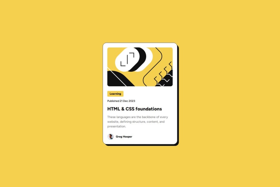
Backdrop move on hovering the title w/ CSS - HTML
#accessibility#bem
@haquanq
Design comparison
SolutionDesign
Solution retrospective
What are you most proud of, and what would you do differently next time?
Hello guys 👋👋👋
I have done this challenge before, here is an update to the old solution. Thought on improving some old mistakes i have made!!
🚀 Built with
- Mobile-first workflow
- Semantic HTML
- Pure CSS
🐲 What i have done
- When you hover the link - card shadow will move.
- Overridden default effect on focus (links).
None 🐱
What specific areas of your project would you like help with?Any feedback is appreciated 🙏
Community feedback
- @xNyfPtxPosted 8 months ago
I think you could have used the :has pseudo selector instead of a span for the shadow.
0@haquanqPosted 8 months ago@geomydas Yes, but..
because of browser compatibility
I used span!
0
Please log in to post a comment
Log in with GitHubJoin our Discord community
Join thousands of Frontend Mentor community members taking the challenges, sharing resources, helping each other, and chatting about all things front-end!
Join our Discord
