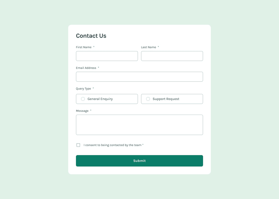
Authentication Validation Contact Form
Design comparison
Solution retrospective
"Thank you for reaching out to us! Your message has been successfully submitted, and our team will get back to you shortly. We appreciate your patience and look forward to assisting you. If you have any urgent queries, feel free to contact us directly through our support email or phone number. Have a great day!"
What challenges did you encounter, and how did you overcome them?Challenges Encountered: During the process of building the project, one of the major challenges I faced was ensuring the form validation was both user-friendly and functional. Initially, getting the form fields to properly validate inputs, especially the email field with regex, was a bit tricky. Additionally, making the form fully responsive across all screen sizes required multiple iterations to get the layout just right.
How I Overcame Them: To resolve the validation issues, I spent time debugging and refining the regex for email, while also improving the error messages to make them clearer for users. For responsiveness, I used Tailwind CSS and ensured to test the form on different devices and viewports, tweaking the design until it looked perfect on all screens.
What specific areas of your project would you like help with?There are a few specific areas where I would appreciate some help:
Form Validation: While the form is working fine, I want to make sure the validation is as robust as possible. I'm currently using regex for email validation, but I want to know if there are better approaches or best practices for handling form validation more efficiently, especially with larger forms.
Responsive Design: Although the design is responsive, I'm looking for feedback on optimizing it further for mobile devices. Specifically, I want to ensure that the layout scales smoothly across all screen sizes without any issues in spacing or alignment.
Code Optimization: I feel that some parts of my code could be refactored to make it cleaner and more maintainable. I'd appreciate advice on how to better structure my state management or simplify some of the event handlers.
Error Handling: Currently, I'm handling form errors with basic useState. Are there better ways to manage form errors, perhaps using React Hook Form, Yup, or Zod for validation?
Community feedback
- @motuncodedPosted about 1 month ago
Congratulations to you on the completion of the project.
Few suggestions for a better HTML structure:
<p className="text-[14px] text-[#383a3b] mb-1 font-normal"> First Name <span className="text-[#0d6eff]">*</span> </p>can be changed to<label htmlFor="firstname" className="text-[14px] text-[#383a3b] mb-1 font-normal"> First Name <span className="text-[#0d6eff]">*</span> </label>and for every input field.- The p tag for the error can be changed to this
<p id="error-message" aria-live="assertive">{error.message}</p>to allow screen readers to understand that it is validation errors.
hope this is useful
Marked as helpful0
Please log in to post a comment
Log in with GitHubJoin our Discord community
Join thousands of Frontend Mentor community members taking the challenges, sharing resources, helping each other, and chatting about all things front-end!
Join our Discord
