Submitted almost 2 years ago
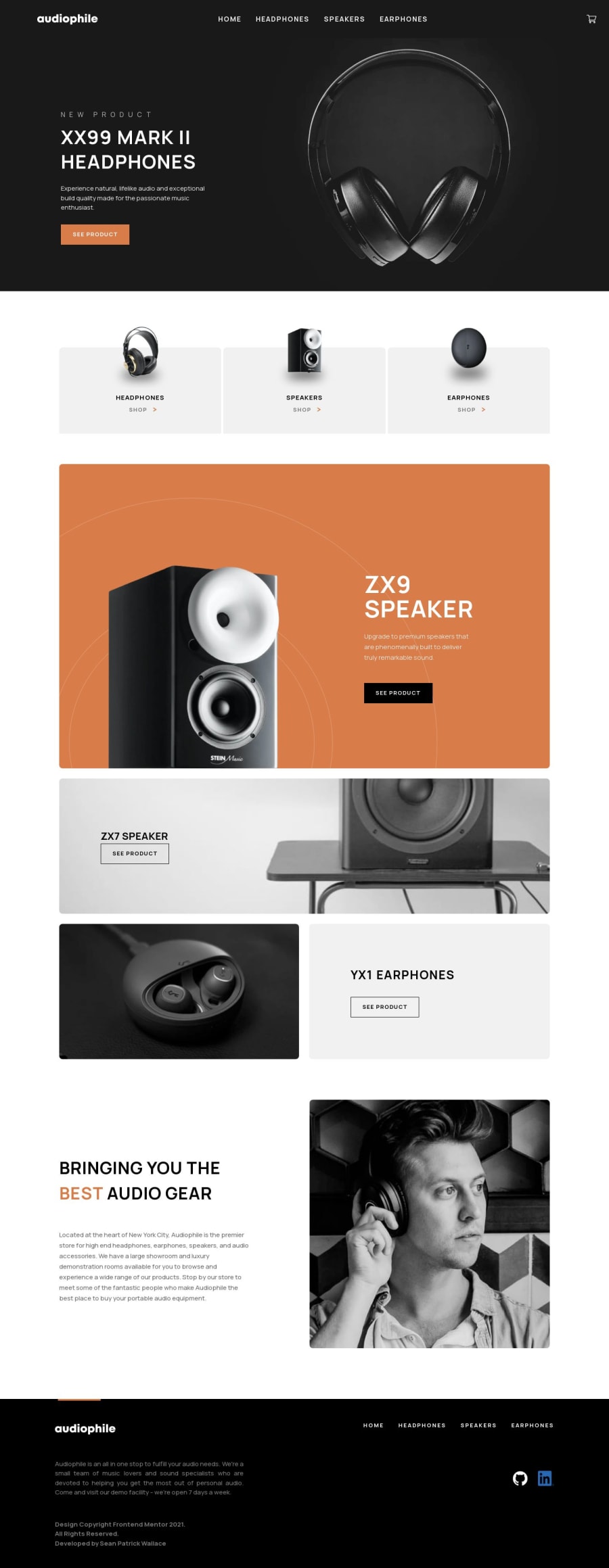
Audiophile website built using Next.JS
#next
@therealseanwallace
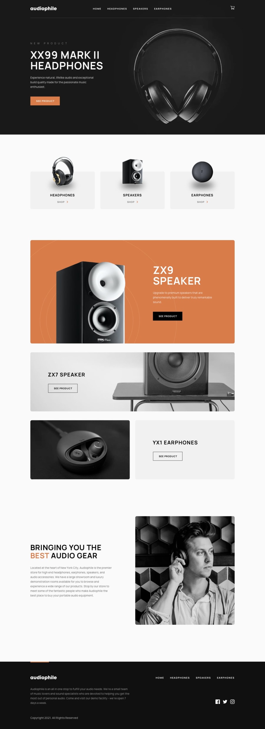
Design comparison
SolutionDesign
Solution retrospective
This was my first attempt at a big frontend project, and I largely focused on making it look good i.e.:
- I didn't do form validation
- I didn't make a backend
- I didn't even use localStorage to make the cart persist between sessions
And nor do I intend to - I'm ready to move on.
One problem I encountered was that I used react-modal to make the checkout modal and positioning it properly was a challenge which I didn't figure out yet. If anyone has any ideas about that, I'd love to hear them.
Also, if anyone wants to offer feedback on my use of:
-CSS
- React
- Next
- JSX
- Or just generally any anti-patterns you see
Then that would be very welcome.
Community feedback
Please log in to post a comment
Log in with GitHubJoin our Discord community
Join thousands of Frontend Mentor community members taking the challenges, sharing resources, helping each other, and chatting about all things front-end!
Join our Discord
