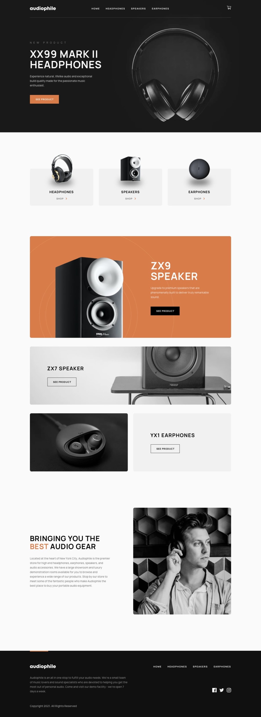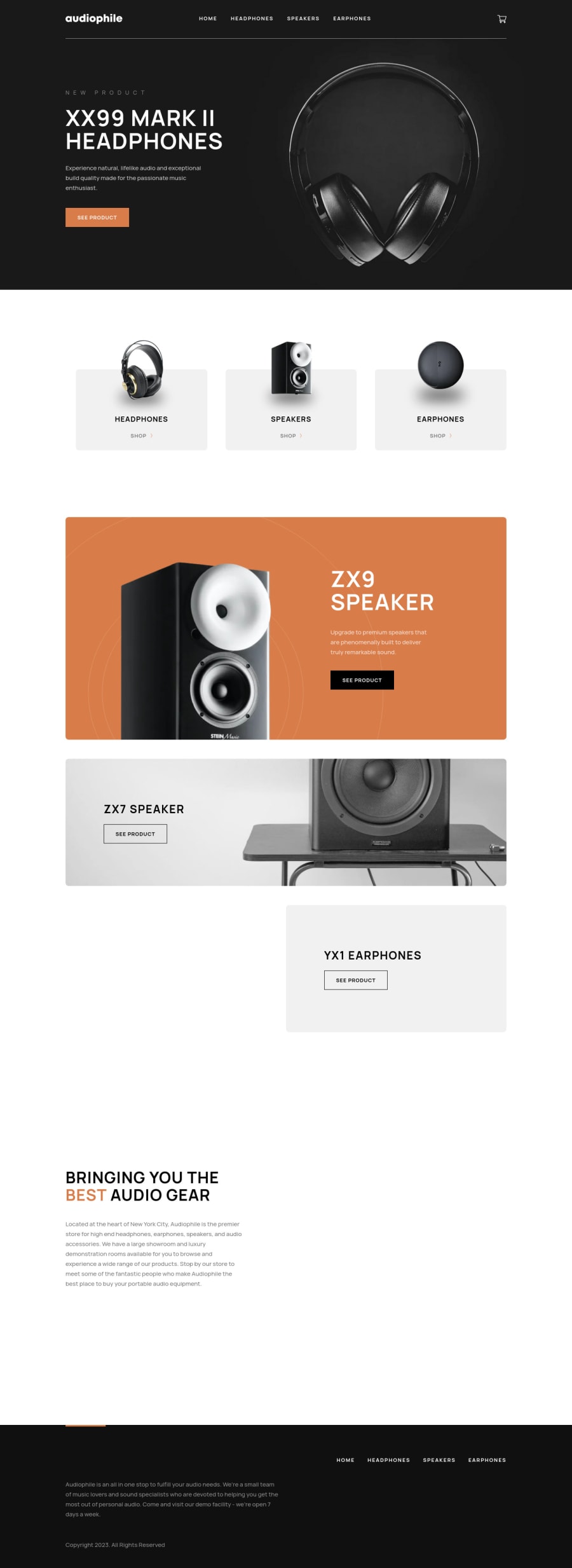
Audiophile ecommerce website w/ NextJs, Typescript, Styled-Components
Design comparison
Solution retrospective
👨💻 Hello everyone!
This is, without a doubt, my biggest and best project so far. I am very happy with the result and I believe I did a good job. During development, I faced many challenges as I used technologies I didn't have much experience with, but it was very rewarding.
In addition to all the functionality required by the mentor front-end I added:
- Control of items in the cart made with Redux
- Pre-loading with React Loading Skeleton
- View the items in the cart even if you refresh the page
If you have any suggestions for code improvements, feel free to share!
Thanks! 😊
Community feedback
- @grace-snowPosted over 1 year ago
Hi
As promised, here's some accessibility-related and other bits of feedback. I hope it's helpful!
- The mobile nav toggle must have aria-expanded; and should be inside the nav element. It should be placed in the DOM directly before the content it is toggling. This has illogical tab order at the moment and is inaccessible for people using things like screenreaders because they don't know if the nav list is open or not and have to tab several times to get to it.
- Make sure the checkout modal and mobile menu close on focus out. It's very confusing for a keyboard user for these to stay open, and easy for them to continue moving through the page beyond any overlay. The alternative would be treating them as proper accessible modals, which would mean managing focus and setting all other elements on the page to
inert
(a lot more work). - The logo alt must say the same as the logo. If you want to use the alt to label the link as well it would need to be something like
Home page - Audiophile
- You really shouldn't need two different navs for mobile and desktop... That's not bad but very unusual and any unnecessary dom clutter is using up more browser memory for no reason. I'm also really surprised to see styles written with desktop-first media queries. By this stage of challenge it should be mobile first every time.
- Make sure images can't get distorted (the one in the 'best audio gear' section of the content and all the product page images) - Use
object-fit: cover;
(or contain). That best audio gear image is off center on small screens too because ofleft: 16px
- You shouldn't need that anywhere. - Headings must go in order. 'Ribbon text' like 'New product' is just a paragraph really. If you want it to have a little extra affordance you could wrap both the ribbon text and title in a hgroup element.
- Never ever ever set aria-label to be different to the visible label on an element! I can't stress how important that is. Doing that has immediately made the 'see product' links inaccessible. Remember how important it is for people to be able to use voice control. They would say "See product" but nothing would happen. Same on all navigation links. You never need to add 'Go to X' in links anyway as they are already links. Same again with the social links that must only say the name of the platform.
- Personally, I think product images deserve proper alt descriptions
- I would expect the footer in this to have a nav element with an aria-label of 'footer'. Once that's done you will also need an aria-label on the header nav like 'main' or 'primary'
- Text should never be in divs or spans alone. Always use a meaningful element, even a paragraph (e.g. the prices)
- In the open cart button at the top, the counter must not be inside that button. That's really important information. I'd expect that outside of the button and accompanied with some visually hidden text so it could be read out to screenreaders like "Items in cart: 1". This element would also need an aria-live attribute so it is announced when this number changes.
- The product pages jump from h1 to h3. It's important for headings to be in order. (and rare a section will be titled by anything other than a h2 tbh)
- At some screen sizes product images and descriptions are hitting into each other. Make use of the gap property to avoid this.
- Product images in the grid definitely need alt descriptions. Also you cannot have a section with no title and especially not with any content in at all (which is effectively what a load of images with no alt becomes)
Marked as helpful2@AdrianoEscarabotePosted over 1 year ago@grace-snow Hi, Grace! Thank you so much for your attention, your feedback is very important to me!
I appreciate all the tips you gave me. I made some changes to the project and it's much better now. Regarding the checkout modal, I have a question. I was also concerned about users being able to focus on elements outside the modal, but I didn't go deeper into how to prevent it. Thank you for suggesting
inert
; I didn't know about it. However, I think I can achieve this functionality with afocusout
event on the modal button. Since the modal is open, the first thing the user will focus on will be the modal, and when they lose focus, the modal will close automatically. This might be a solution, but I'm not sure if it will be very accessible.0@grace-snowPosted over 1 year ago@AdrianoEscarabote a focus out would be fine as long as focus returns to the trigger element (the button that opened it)
0 - @seangray-devPosted over 1 year ago
Nice work bro! I'm currently working on this one myself with Vite.
I love the hover effects you added as well as the loading page that was a nice touch 👏
Some small details I think could help to look into some layout issues when adjusting screen sizes for example one was on the homepage zx-9 speaker.
Otherwise I really enjoyed this, good work!
Marked as helpful0@AdrianoEscarabotePosted over 1 year ago@seangray-dev Thanks for the feedback!! You can be sure that I will improve the appearance of the image!
as it is a big project sometimes the small details go unnoticed hahaha
0
Please log in to post a comment
Log in with GitHubJoin our Discord community
Join thousands of Frontend Mentor community members taking the challenges, sharing resources, helping each other, and chatting about all things front-end!
Join our Discord