Submitted over 2 years ago
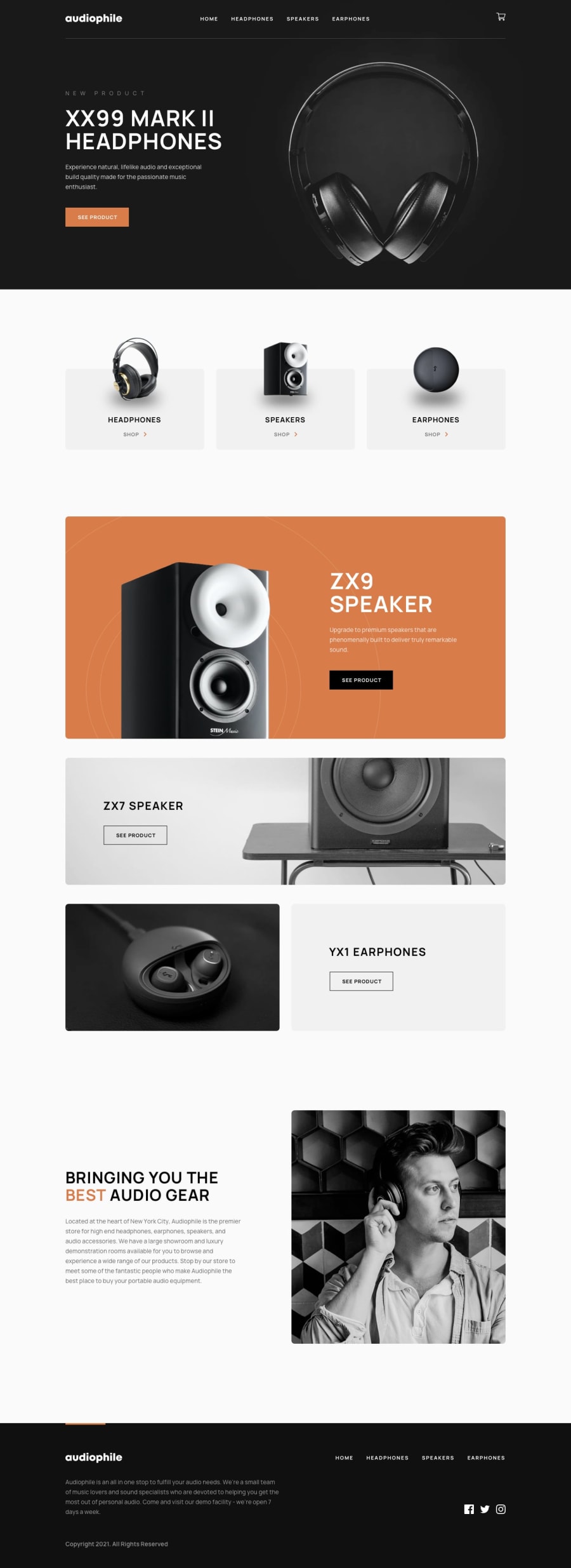
Audiophile e-commerce website (NextJs + StyledComponents + Formik)
#next#styled-components#react
@leoikeh99
Design comparison
SolutionDesign
Solution retrospective
All feedbacks are welcome
Community feedback
- @AlexKMarshallPosted over 2 years ago
From a visual perspective, this does look very good. The site responds very well to different screen sizes, and zoom.
However, there are some very serious accessibility problems that make this completely unusable for anyone using a keyboard or assistive technology like a screen-reader
- Never add
onClickhandlers to things that aren't a<button>- your quantity inputs, the +/- spinners and the cart button itself are all unusable - The cart modal is missing all elements that make a modal work. It doesn't trap focus, prevent scrolling behind, or make the rest of the site inert. I'd suggest using a 3rd party tool for dialogs to avoid these problems. Reach UI, HeadlessUI and RadixUI all have good ones
- The checkout button, arguably the most important button on an eCommerce site doesn't have a visible focus indicator
- You have motion animations all over the place, but you don't switch them off for people with
prefers-reduced-motion- this is a serious problem for people who can be made dizzy or to feel sick from these kind of animations. Also for people who just want to switch them off because they find them annoying - Your images seem to all be set as background images. Particularly for a product image, it's critical that they have suitable
alttext, so these must be real images in the dom, not just CSS backgrounds. They're not just for decoration
Marked as helpful0 - Never add
Please log in to post a comment
Log in with GitHubJoin our Discord community
Join thousands of Frontend Mentor community members taking the challenges, sharing resources, helping each other, and chatting about all things front-end!
Join our Discord
