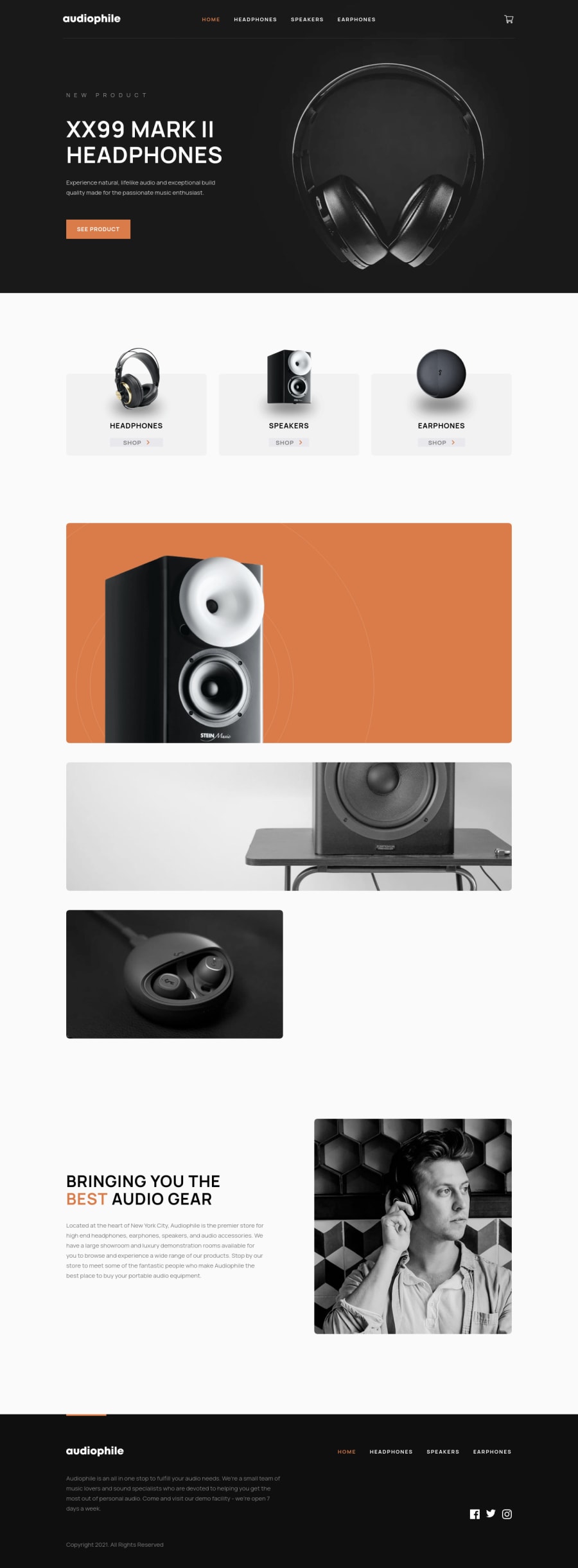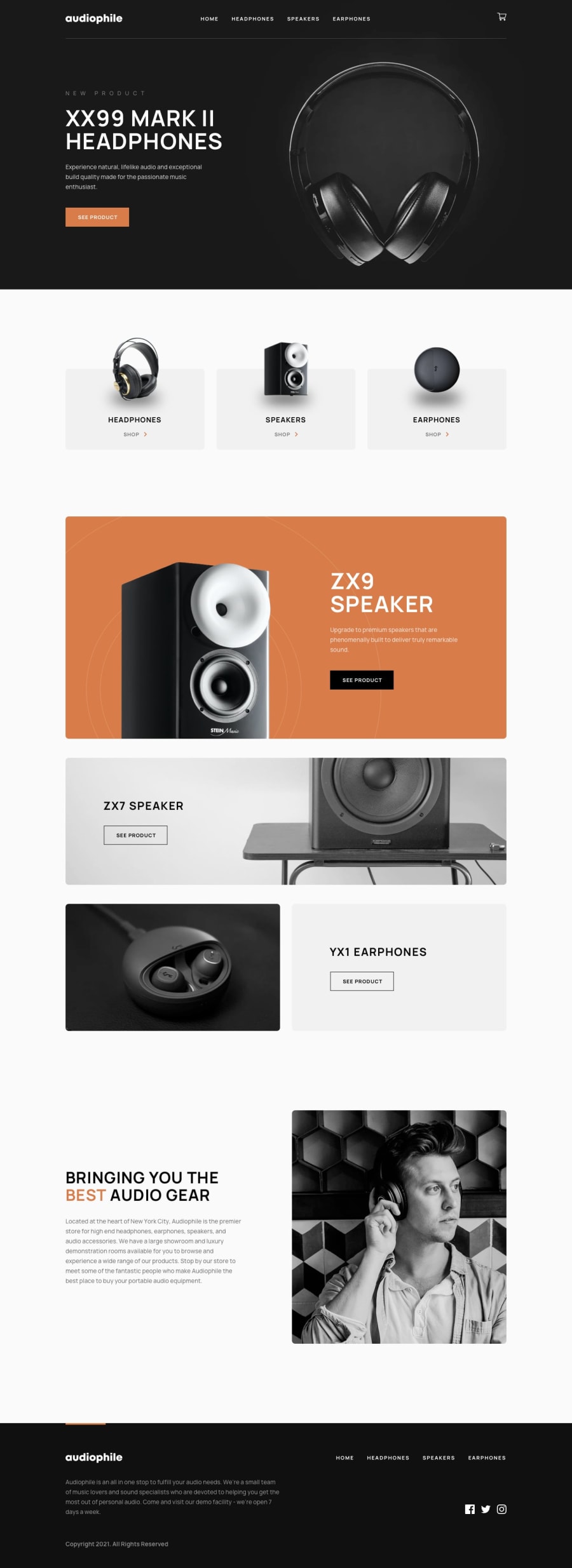
Design comparison
SolutionDesign
Solution retrospective
Hey,
I already submit this challenge once but I've made quite a lot of modifications/optimizations so I think it could be a good idea to have your thoughts about that version...
- I developped a Toast message functinality from scratch (animated easily with 'framer-motion').
- I tried to make the website more accessible (keyboard navigation for modal and forms for example).
- I also tried to optimize the 1st loading => reduced content/colors shift for example.
- Finally, I added a few animations.
I'm really eaging to have your ideas to improve my project at the maximum!
Thanks!
Community feedback
Please log in to post a comment
Log in with GitHubJoin our Discord community
Join thousands of Frontend Mentor community members taking the challenges, sharing resources, helping each other, and chatting about all things front-end!
Join our Discord
