Audiophile e-commerce React Typescript Sanity Chakra UI React hook for
Design comparison
Solution retrospective
Hello Frontenders,
I'm back with my first Guru challenge solution for an awesome Audiophile e-commerce website.
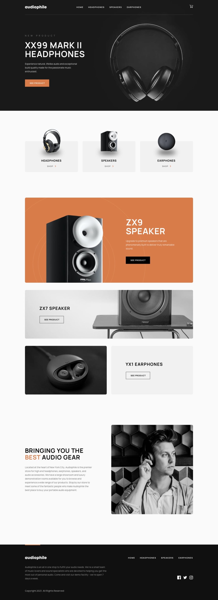
This was an interesting challenge to work on and I learned A LOT! This was my first project where I used Typescript and Chakra UI, since there was no authentication task in this challenge I used Sanity as a headless CMS for all content management to keep my website as structured and dynamic as possible which led to some severe challenges how to keep all code dynamic and how to make React components as reusable as possible. As this was my first project using Typescript I got myself in some challenging situations and I think that it is not the best way of using Typescript since I was more of exploring how to work with Typescript in big projects like this. I enjoyed working with Chakra UI as it provides a set of accessible, reusable, and composable React components that make it super easy with inline styling and super easy to make a responsive website with breakpoints. Also, I switched from px to rem in the middle of development and I used an extension to change px to rems, so there are some styles left in px's. Is it worth to switch from px to rems? I have achieved a 99% Lighthouse score for performance 🚀, 95% for best practices ✅, and 94% for accessibility 🌐.
Please help me test my app feedback is welcomed, thank you.
Community feedback
Please log in to post a comment
Log in with GitHubJoin our Discord community
Join thousands of Frontend Mentor community members taking the challenges, sharing resources, helping each other, and chatting about all things front-end!
Join our Discord
