

Design comparison
Solution retrospective
Roast my semantic HTML usage.
Any tips about my React code are also welcome
Community feedback
- @grace-snowPosted about 2 years ago
Hello
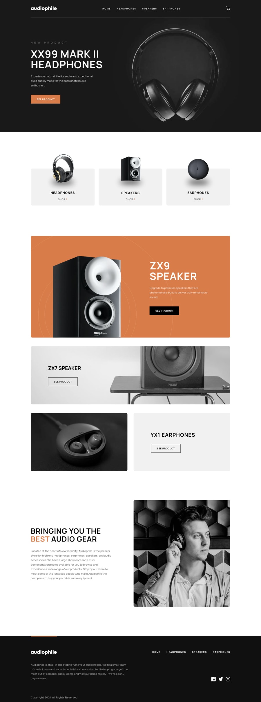
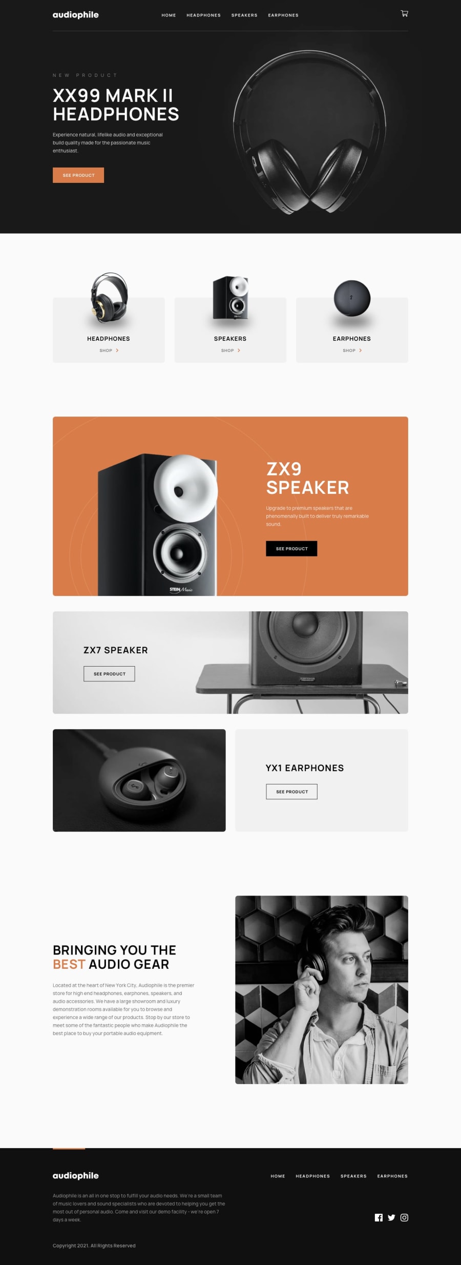
Here is lots of feedback based only on reviewing the home page. Most of these are really foundational things that I would expect you to have well established by the time you came to this project. You may need to go back and do smaller projects to solidify the essential foundations of html and css
- You're missing a
headerelement. That does not belong in main, it's its own landmark and is designed to hold repeating content that sits atop every page like the logo and navigation. - Is "logo" the name of this site and does it communicate the destination of that link? Nope. So either the image alt should say "Audiophile - Home" or the alt left blank and sr-only text or aria-label on the link
- You have an event listener on an image for the mobile nav toggle. HUGE no-no. Always use interactive elements for interactive behaviour. This follows a classic disclosure pattern that you should be able to write accessibly every single time:
nav > button with aria-expanded and label + ul > li > a for the nav links. The button to toggle the nav must sit within the nav element, directly before the list it is toggling. I would not have the logo link inside the nav element - Similar for the cart. That's a button if it's interactive.
- Ideally, when modals open everything else on the page should go inert and focus should move to the modal (see the scott ohara modal dialog pattern for more info). For a junior dev you may not be expected to know this already, but it will be a delightful surprise to any employer that you'd thought this through.
- Capitalise text via CSS, never in the html
- You're missing a h1. Headings should go in order and properly communicate the structure of the page
- Sections always need headings. Even if they are sr-only (visually hidden but accessible). If it shouldn't have a heading, it shouldn't be a section
- The product categories eg Headphones are headings
- Alt text should be a meaningful description of the image and should never include words like "image" or "picture. It is already an img element, with an image role
- Decorative images like chevron icons must have empty alt like
alt="" - Why is
ZX7 SPEAKERa h4? Does it belong to theZX9 SPEAKERcontent above? If not, then it must not be a lower heading level. Again, headings must go in an appropriate order to communicate the structure of the content, much like a contents page in a long document. Same issue withBRINGING YOU THE BEST AUDIO GEARbeing a h5. That makes no sense - You can't have alt on a background image. If it is a meaningful image it should be in the html as an img tag and have proper alt text. If it is a meaningless (decorative) image it can be a background image
- Similar, you don't use title attribute to label images. Img tag and alt if it is a meaningful image
- If you have a nav in the footer, you should use another nav element there. The aria-label on the header nav can be
Main siteor something; and the aria-label on the footer nav can befooter - With social links you cant have 3 different icons wrapped in one completely unrelated link. They should each be a link to the relevant site, labelled, and in a list. As they go to external sites, usually these links would be set to open in a new window. That is a good use for the title attribute to say
(opens in new tab)
Looking at the CSS, I am concerned at the amount of explicit widths and heights on things. Go into your browser settings, select to
zoom text onlythen zoom in on the browser. You will see literally everything break because of all the fixed heights/widths used in px Instead, prefer min-height and max-width for containers. This will give you much more responsive layouts because it allows the height to grow and the width to shrink as needed. Alternatively there are functions like min() max() clamp() or minmax and units like fr when using grid and flex-basis -grow and shrink when using flexDon't put max width in pixels on any text element like a heading or paragraph. That should only ever be in a responsive unit like ch
Font size should never be in px, use rem
I hope this is helpful
3 - You're missing a

Please log in to post a comment
Log in with GitHub
Join our Discord community
Join thousands of Frontend Mentor community members taking the challenges, sharing resources, helping each other, and chatting about all things front-end!
Join our Discord