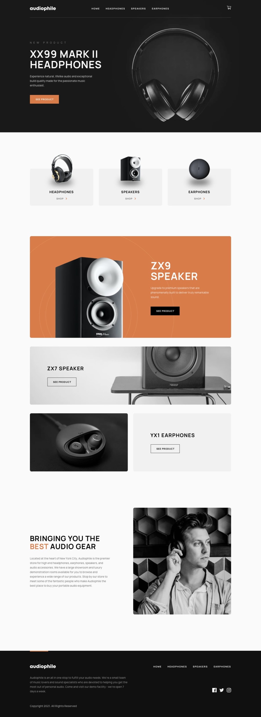
Design comparison
Solution retrospective
I am particularly proud of the creation and integration of both the frontend and backend components of the project. The frontend adheres to best practices in accessibility and responsive design, featuring pleasant animations that do not hinder navigation. The functionality and logic have been thoroughly tested and perform appropriately on both the client and server sides.
What would I change next time?
• Would use TypeScript (a personal preference, especially in the context of Astro and Node) for the project’s development.
• Would leverage Astro’s Server-Side Rendering (SSR) capabilities to dynamically create pages using a database and an API.
• Would utilize Astro’s actions for communication with the API.
What challenges did you encounter, and how did you overcome them?The most challenging part was using Astro as a framework for the first time and optimizing its use. Additionally, I worked with a predominantly vanilla structure (without React), managing everything with JavaScript and SCSS.
What specific areas of your project would you like help with?As always, all advice and feedback are welcome, and any help or constructive criticism will be gladly received. Thank you in advance! Signing off with a cookie and a :wq. 🍪
Community feedback
Please log in to post a comment
Log in with GitHubJoin our Discord community
Join thousands of Frontend Mentor community members taking the challenges, sharing resources, helping each other, and chatting about all things front-end!
Join our Discord
