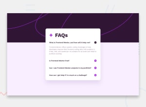
Attractive FAQ component using HTML,CSS and VANILLA JAVASCRIPT
Design comparison
Solution retrospective
If you have any suggestions, Happy to Listen 😄
Community feedback
- @MelvinAguilarPosted 12 months ago
Hello there 👋. Good job on completing the challenge !
I have some suggestions about your code that might interest you.
-
The use of
outline: none;in buttons should be reconsidered for the sake of accessibility. The outline is an essential visual indicator for users who navigate with keyboards or screen readers. Removing the outline can make it challenging for users with disabilities to identify which element is currently focused.Consider customizing it to better fit your design while preserving its visibility, for example:
outline: 2px solid blue;
- Prefer
min-height: 100vhoverheightto prevent component cutoff on smaller screens.
I hope you find it useful! 😄 Above all, the solution you submitted is great!
Happy coding!
1 -
Please log in to post a comment
Log in with GitHubJoin our Discord community
Join thousands of Frontend Mentor community members taking the challenges, sharing resources, helping each other, and chatting about all things front-end!
Join our Discord
