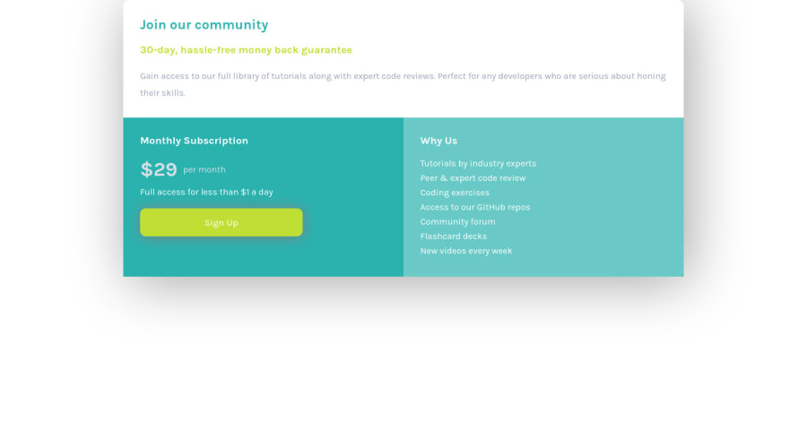
Design comparison
Solution retrospective
any feedback will be much loved! and i'll give you a cookie 🍪
Community feedback
- @Bayoumi-devPosted almost 3 years ago
Hey Khadija, It looks good!...
My suggestions:
Document should have one main landmark, Contain the component with<main>.
<main>
   <div class="container">
      //...
   </div >
</main>
Page should contain a level-one heading, Changeh2toh1
<h1>Join our community</h1>You should always have one
h1per page of the document... in this challenge, you will useh1just to avoid theaccessibility issuethat appears in the challenge report... but don't useh1on small components<h1>should represent the main heading for the whole page, and for the best practice use only one<h1>per page.- Also, I suggest you center the component on the page, by giving the parent element
<main>the following properties:
main {
   display: flex;
   justify-content: center;
   align-items: center;
   min-height: 100vh;
 }

.container {
    width: 350px;
    /* margin: 0 auto; */   <--- Remove
    //...
}
I hope this is helpful to you... and I want a cookie 🍪
1@khadijahashmi2Posted almost 3 years ago@Bayoumi-dev Hii! thankyou so much, i just posted my edited solution, it was really helpful! here's a cookie 🍪 and some milk to go with it 🥛 :D
0 - @SamadeenPosted almost 3 years ago
Hey!! Cheers 🥂 on completing this challenge.. .
Lets firstly work on your accessibility issues.
Document should have on main landmarkbasically means your html should be structured more semantically and the correct format should be your<header>......</header>followed by your<main>......</main>and lastly your<footer>....</footer>hence you should use<main class="container">instead of<div class="container">.Page should contain a level-one headingbasically means yourhtmlshould have ah1it aid navigation hence<p>Join our Community </p>should be<h1>Join our community</h1>and you should also go down orderly when you are using the headings h1 down to h2 down to h3 and so on.
This should fix most of your accessibility issues.
- You can use
flexorgridto center your container horizontally and vertically.
. Regardless you did amazing... hope you find this helpful... Happy coding!!!
0@khadijahashmi2Posted almost 3 years ago@Samadeen hiiii!! thankyou soo much, it was reallyy helpful, i really appreciate your encouragement :D i just posted my edited solution. here's two cookies 🍪🍪
0
Please log in to post a comment
Log in with GitHubJoin our Discord community
Join thousands of Frontend Mentor community members taking the challenges, sharing resources, helping each other, and chatting about all things front-end!
Join our Discord
