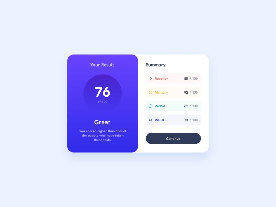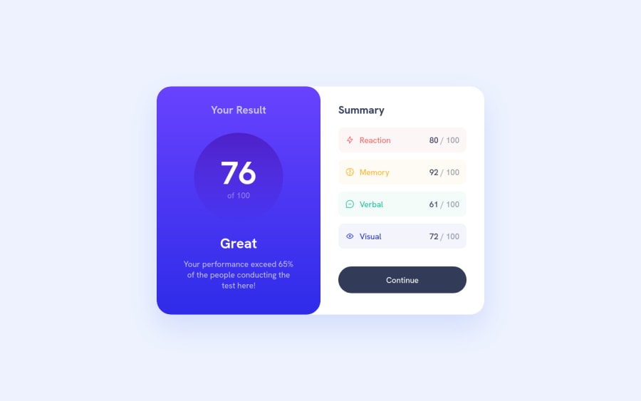
Astro+Tailwind+React solution / stretched design fixing inconsistency
Design comparison
Solution retrospective
I am struggling to match the fonts and especially the gradients from figma file. Font: using the weights from figma feels a bit too strong. Have chosen one class thiner.
Gradient: and the gradient - especially circle - has much more purple in my solution (copy&paste the gradient from figma)... any ideas what I am doing wrong?
And texts are sometimes not 100% centered but some pixels off. Plus tailwind would in some cases go with slightly larger / smaller pixels coming from rem.. which I would propose to go for... always looks super nice. Also the tailwind color scheme.... And opacity of 51,68%?? wtf.. using 50%.
So.. a bit of discussion with / feedback for design person in a real scenario :-p
Thanks for the challenge!
Community feedback
- @SppamLitePosted over 1 year ago
Hey Sebastian👋 Nice job on completing this challenge!
I'm glad you found the font difference between figma and your browser, good catching on those nice details! To fix that issue, you could add these two css:
-webkit-font-smoothing: antialiased; -moz-osx-font-smoothing: grayscale;
to yourbody
, I make it as part of my default css reset every time. You could check out this link for more details about the font smooth on MDN.If you side by side comparing your chrome browser with your Figma desktop window, most likely, yes, the color will be slightly different, but there is nothing to do with your gradient, it is because Figma desktop has different colorspace setup than chrome browser. (I found Firefox looks better than chrome).
To answer your last question where I also found it is confused, like opacity 51.68% etc, a lot of time designers are not typing on the keyboard for those values, they use the mouse/trackpad and just drag the sliders to change something, which will make us as developers going crazy 🥲.
Not mentioned that there is difference between visually centered vs geometrically centered in design principles (well that is whole another topic to discuss), that's why sometimes you see padding left 32 then padding right 40 😂.
Hope I answered your questions!
Happy coding!
Marked as helpful0@spossnerPosted over 1 year ago@SppamLite Thanks for your feedback! That helps. Padding-Left and -Right: probably most people will auto-change that to 50/50 in implementation or do you try to stick to exact values (at least when language and content is static)?
0@SppamLitePosted over 1 year ago@spossner as your codebase gets larger and larger, consistency is quite important, 50/50 is always good. Checkout Tailwind UI, what I could tell is that most components there are 50/50.
However, if you really care about the pixel perfect matching (like what I did for fun in my solutions 😁), and your codebase is not that big, then you could do exact values 🤓.
0
Please log in to post a comment
Log in with GitHubJoin our Discord community
Join thousands of Frontend Mentor community members taking the challenges, sharing resources, helping each other, and chatting about all things front-end!
Join our Discord