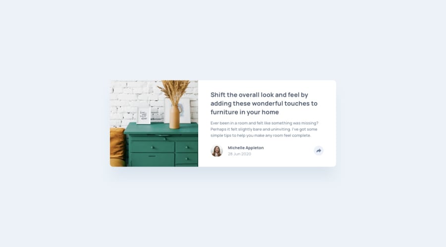
Design comparison
Solution retrospective
Hey everyone 🙋♂️, this is my solution for article-preview-component challenge.
Please take a look and give me your feedback. Thanks :)
Community feedback
- @visualdennissPosted over 1 year ago
Your solution looks great. I don't have any suggestion to add as your version already pretty good. I especially like the spinning arrow icon on click!
If you look for further inspo, you could add a hover effect to the image, e.g. on hover image could scale up a bit like 1.02 or so. Also you could change the arrow icon background color with a smooth transition on hover as well. Additionally, the icons section could appear with a slight animation from opacity 0 to opacity 1 and y 5 to y 0, basically a small fade-up animation. These are just some ideas to add on top if you prefer :)
Hope you find this feedback helpful!
Marked as helpful1 - @gtalinPosted over 1 year ago
Really like your solution for the component specially the animation for the button. You have also used
aria-labelfor the button which is really important for accessibility for someone who uses a screen reader.I just have one small feedback. You have removed the default outline from the button because of which there is no visual cue for someone who uses a keyboard to navigate the website. It is not a good idea to remove outline from
buttons andatags because it makes it difficult for people who only use a keyboard for navigation. And if you do remove the default outline on focus, it is best to add an alternate.Hope the feedback was helpful.
0
Please log in to post a comment
Log in with GitHubJoin our Discord community
Join thousands of Frontend Mentor community members taking the challenges, sharing resources, helping each other, and chatting about all things front-end!
Join our Discord
