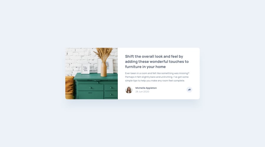
Design comparison
Solution retrospective
Hey All !! Open to suggestions and feedback.
Community feedback
- @VenusYPosted over 2 years ago
Good job on completing this challenge! It looks very similar to the design, which is good.
A few issues I noticed:
-
There isn't a mobile version of the webpage. It's considered best practice in most cases to implement the mobile version of a webpage first before moving on to the desktop version. You can do this using media queries, which determine the points at which you want to change certain styles on the webpage.
-
The popup appears to be positioned relative to the viewport, instead of relative to the card itself. In case you weren't aware, 'position: absolute;' causes the element to be positioned relative to its closest positioned ancestor. In this case, the popup's closest positioned ancestor is the <body> tag, which is why it's moving with the viewport instead of the card. To fix this, you can add 'position: relative;' to container-right, which will then make it the closest positioned ancestor.
-
Once you've clicked the share button, you can no longer close the popup. Instead of changing the visibility with JavaScript, an easier way of achieving the same thing is to use utility classes that toggle on and off when clicking the share button. Look into the .classList and .toggle methods for JavaScript.
-
This is a smaller issue, but the share button doesn't change colour when hovering over it. This is an accessibility concern. You can change the styles of an element that's being hovered over with the :hover pseudo-class.
Hope this helped!
Marked as helpful1 -
Please log in to post a comment
Log in with GitHubJoin our Discord community
Join thousands of Frontend Mentor community members taking the challenges, sharing resources, helping each other, and chatting about all things front-end!
Join our Discord
