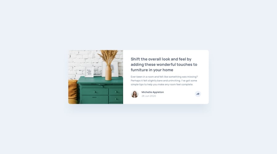
Design comparison
Solution retrospective
In this challenge i am not quite sure i made the desktop share pop out design as good as it should be by what i mean is the alignment so i'd rely apppreciate if you give me a tip on how can i accomplish that but the rest is done as it should be
Community feedback
- @shashreesamuelPosted over 2 years ago
Hey mhcdaeth, good job completing this challenge. Keep up the good work
Your solution looks good however I think you should consider the following
-
The card description should have a line break before the keyword
adding -
Your user information needs to be a bit smaller.
-
Your user avatar needs to be a bit smaller
-
The color of the date needs to be the color specified in the
style-guide.mdfile.
In terms of your accessibility issues
-
idattribute value must be unique -
wrap all your content between
<main>tags to get rid of the rest of accessibility issues
In terms of validation errors
- duplicate id
share
I hope this helps
Cheers Happy coding 👍
0 -
Please log in to post a comment
Log in with GitHubJoin our Discord community
Join thousands of Frontend Mentor community members taking the challenges, sharing resources, helping each other, and chatting about all things front-end!
Join our Discord
