Not Found
Not Found
Not Found
Not Found
Not Found
Not Found
Not Found
Not Found
Not Found
Not Found
Not Found
Not Found
Not Found
Not Found
Not Found
Not Found
Not Found
Not Found
Not Found
Not Found

Submitted

article-preview-component-master

Tharaa369• 100

@Tharaa369

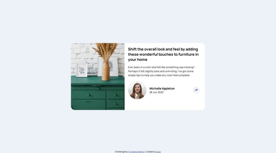
Desktop design screenshot for the Article preview component coding challenge

This is a solution for...

  • HTML
  • CSS
  • JS
1newbie
View challenge

Design comparison


SolutionDesign

Community feedback

Gift Amachree• 870

@jen67

Posted

Hi there, I must say, well done! Your work looks impressive. However, I noticed a couple of areas where some adjustments could enhance the overall presentation:

  1. For the h2 element, consider adding some breathing space at the top. You can achieve this by including the following CSS rule:

h2 { margin-top: 2rem; }

2.The avatar appears a bit large; you might want to consider reducing its size. You can achieve this effect with the following CSS:

.avatar{ width: 4rem; height: 4rem; }

These are just suggestions to further refine your already impressive project. Keep up the great work! If you have any questions or need clarification on any point, feel free to reach out.

Best regards

Marked as helpful

0

Tharaa369• 100

@Tharaa369

Posted

Thank you @jen67

1

Please log in to post a comment

Log in with GitHub
Discord logo

Join our Discord community

Join thousands of Frontend Mentor community members taking the challenges, sharing resources, helping each other, and chatting about all things front-end!

Join our Discord