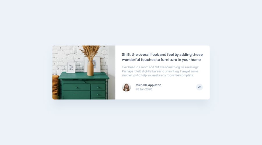
Design comparison
Solution retrospective
1. How to add HTML elements and styles using javascript
- Using innerHTML in javascript
- In this method, I structure the HTML in Javascript files and added it to the document using innerHTML this attribute.
- Advantage: It can add HTML when needed.
- Disadvantage: It makes the JS file too long.
const shareHTML = `

        SHARE


      This is a share button

    `;
const sharePanel = document.createElement("div");
sharePanel.classList.add("sharePanel");
sharePanel.innerHTML = shareHTML;
sharePanel.classList.add("shareStyle");
- Place the HTML in the HTML files, CSS in the CSS stylesheet. We can include the HTML and CSS in advance in HTML and CSS stylesheet. And using Javascript only controls the display attribute of the elements.
- Advantage: This method can define the HTML and CSS of extra content in advance. The presentation and the control logic are separated, which makes the code neat.
socialPanel.style.display = "none";
2. cannot change its fill using javascript (if i have to change the svg fill using javascript) To change the fill of a svg image, the svg image has to be inline. If the svg is inside a label, its fill cannot be changed by setting style.fill. However, placing the style setting all in stylesheets may make this javascript file look better.
Alternate Text
What challenges did you encounter, and how did you overcome them?const shareSVG = shareButton2.querySelector("#shareSVG"); const pathElement = shareSVG.querySelector("path"); pathElement.style.fill = "hsl(210, 46%, 95%)";
How To set the extra panel's position?
- What I do: I use absolute position in this case. I use javascript to calculate the position of the button and get panel's position accordingly. Then I set the panel's position using "top" and "left" attributes.
- What's the problem? This means I have to do this action according to the screen's size since I only do this in larger screen. This may cause different media queries from those in CSS stylesheet. In logic, it may be a better way to make the position relative, but how to do it?
  if (window.innerWidth > 910) {
    const buttonRect = shareButton.getBoundingClientRect();
    const buttonX = buttonRect.left;
    const buttonY = buttonRect.top;
    //use the button position to set panel position
    socialPanel.style.position = "absolute";
    socialPanel.style.top = `${buttonY - 100}px`;
    socialPanel.style.left = `${buttonX - 150}px`;
  }
How Javascript adjust to responsive design? How javascript may use media Queries? It is a good idea to use media queries in javascript too? What will be a safer way to use media queries in javascript? What are the common scenarios? If not using media queries, how to adjust js codes for different screen sizes just like in this case?
- What I do? I put all CSS relative codes in CSS stylesheet including media queries. This means adjusting the styles of the extra panel in stylesheet only.
- How To set the extra panel's position relatively?
- How Javascript adjust to responsive design? How javascript may use media Queries?
Community feedback
Please log in to post a comment
Log in with GitHubJoin our Discord community
Join thousands of Frontend Mentor community members taking the challenges, sharing resources, helping each other, and chatting about all things front-end!
Join our Discord
