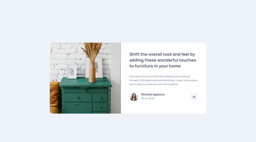
Design comparison
Solution retrospective
I am new at the frontend development. I would be appreciated if you give me any suggestion.
Community feedback
- @MehmetCanBOZPosted over 3 years ago
Thank you very much, Adam, for writing such detailed comments. I will observe your advice about the project. I will look at your project also. I am trying to improve myself by creating this type of project. I think the best learning method is practise.
Happy Coding...
0 - @aemann2Posted over 3 years ago
Hey Mehmet,
Nice solution! This one took me a long time, so it's good to see what others have done who have finished it. A few things:
The
<p>text is a little small. I think when I did this one I actually ignored the recommendation in the style guide because when I tried using it, I could barely see the text.I also tried setting the image with the
<img>tag for this project. If I were to go back and do it again, however, I would have made the section of the card with the image a<div>, and set the image as a background image. The reason (I've recently found) is that background images are easier to control than<img>images.Also, if I were you, I would have done something different with the Javascript. It looks like you're using it to display certain styles according to the screen width. I think it would be much easier to use media queries for this, and use the Javascript to control what appears when you click on the share buttons. Check out my solution if you're interested.
Hope this helps!
-Adam
0
Please log in to post a comment
Log in with GitHubJoin our Discord community
Join thousands of Frontend Mentor community members taking the challenges, sharing resources, helping each other, and chatting about all things front-end!
Join our Discord
