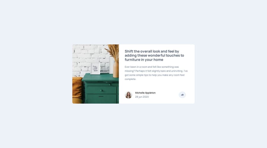
Design comparison
Solution retrospective
any feedback is welcomed
Community feedback
- P@hectorlil48Posted 8 months ago
Great work on this, but you may need to adjust the spacing. On desktop, there's too much space between the share div and the paragraph. Also, don't forget to change the border-radius on the image.
Marked as helpful1@Medido1Posted 8 months ago@hectorlil48 Thank you for you input, i adjusted the spacing. but why should i change the border-radius ?
0P@hectorlil48Posted 8 months ago@Medido1 when you go to mobile the image becomes bigger than the container and the edges of the image is not round like they should be. But you should see why your container disappears when you go to mobile?
Marked as helpful1@Medido1Posted 7 months ago@hectorlil48 i see what you are saying. and i fixed the container disappering in mobile view thank you so much
0
Please log in to post a comment
Log in with GitHubJoin our Discord community
Join thousands of Frontend Mentor community members taking the challenges, sharing resources, helping each other, and chatting about all things front-end!
Join our Discord
