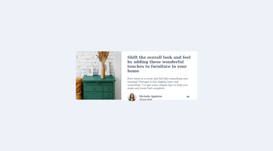
Design comparison
Solution retrospective
This challenge was quite interesting though i found some difficulties at the level of displayin the social media icons uppoon the share icon click. Any feedback would be highly welcomed .
Community feedback
- @romila2003Posted over 2 years ago
Hi @BLADEHEDA,
Congratulations for 🎉 for completing this challenge, the Article preview component looks good and it is great that you used the right semantic. There are some issues/suggestions I want to address:
- I noticed that you took a desktop-first approach however I would strongly suggest you follow a mobile-first approach instead as it is easier for responsiveness, and it is also best practice to do so.
- The
font-familycan be found within the style-guide that is given to you when you download the starter pack. - Instead of using
position: absolute;to center the card, you can use theflexproperty instead e.g.
body {
  display: flex;
  align-items: center;
  justify-content: center;
  min-height: 100vh;
  flex-direction: column;
}
To make the share-icon functional, you can use the
togglefeature within JS. The toggle feature is like an on/off switch that will show the icon when click and then close the icon when clicked again.Overall, great attempt and wish you the best for your future projects so keep coding 👍.
0
Please log in to post a comment
Log in with GitHubJoin our Discord community
Join thousands of Frontend Mentor community members taking the challenges, sharing resources, helping each other, and chatting about all things front-end!
Join our Discord
