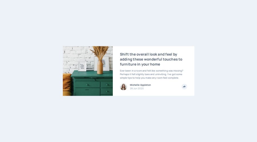
Design comparison
SolutionDesign
Solution retrospective
What are you most proud of, and what would you do differently next time?
None
What challenges did you encounter, and how did you overcome them?There were two ways to display the share box, one for the mobile view and another for the desktop view. The desktop was easy but the mobile one was hard to do so I dropped it and made the design similar in both views.
What specific areas of your project would you like help with?None
Community feedback
- @wcyin9Posted 6 months ago
Hi there!
Very excellent job on your solution! One thing I would note is to add a code in your JS for the color of the button to go back to default after closing the share menu.
In terms of the CSS for the mobile version of the share menu, you can set its position relative to the author information, and use
topandbottomto adjust it to the bottom of the container.1
Please log in to post a comment
Log in with GitHubJoin our Discord community
Join thousands of Frontend Mentor community members taking the challenges, sharing resources, helping each other, and chatting about all things front-end!
Join our Discord
