Design comparison
Solution retrospective
Hello everyone,
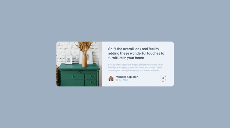
I had a lot of problemes during this project. I didn't manage to change the color of the share button as I wanted and to position it well in phone format (responsive). If you have any feedback for me, I would be happy to hear them.
Have a nice day !
Community feedback
- @brasspetalsPosted over 3 years ago
Hi, Pierre! 👋
I think the easiest way to handle svg color changes is to use inline svg and the
fillproperty. Here's a short article that demonstrates some ways to use it. I also suggest addingborder: noneto your button, to get rid of the default border.To make room for the button on your mobile modal, you could change
justify-contenttostartand add eithergapor themarginproperty to the social links.Hope this helps and happy coding! 😄
1
Please log in to post a comment
Log in with GitHubJoin our Discord community
Join thousands of Frontend Mentor community members taking the challenges, sharing resources, helping each other, and chatting about all things front-end!
Join our Discord
