Design comparison
SolutionDesign
Solution retrospective
What are you most proud of, and what would you do differently next time?
a
What challenges did you encounter, and how did you overcome them?b
What specific areas of your project would you like help with?c
Community feedback
- @robcrockPosted 5 months ago
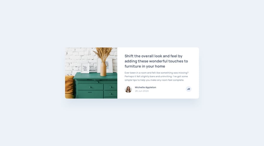
First off, the card looks great. Because this is a critique, I wanted to find a few things to key in on incase you would like to iterate on the submission:
- The solution doesn't have much of a shadow. Changing yours to be closer to the solution would make a big difference.
- If the tooltip was a little wide the share links could get enough room to not feel as squished.
- The footer on mobile feel jarringly different from the solution. If you could keep the share button in the same position as it is in when it is inactive, then it will feel much better.
- Your card changes for several more breakpoints than the two in the style guide. You could get closer to the design and possible save some awkward in between states be only design for the two screen sizes in the style guide.
Marked as helpful1
Please log in to post a comment
Log in with GitHubJoin our Discord community
Join thousands of Frontend Mentor community members taking the challenges, sharing resources, helping each other, and chatting about all things front-end!
Join our Discord
