Design comparison
SolutionDesign
Solution retrospective
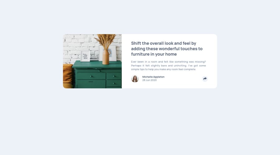
I have completed this challenge but face a few issues and still have doubts about it:-
- how to use padding & margin through bootstrap for mobile layout but i used vallina CSS for desktop layout. is it best practice to use padding & margin in this way or does bootstrap also have responsive P & M too.
- "arrow down" in social media links. I have used font-awesome icon for that with position absolute.
- position for social links. i am able to do this through position absolute. Please share your valuable feedback on this challenge. your feedback will help me to understand more about my mistake.
Community feedback
Please log in to post a comment
Log in with GitHubJoin our Discord community
Join thousands of Frontend Mentor community members taking the challenges, sharing resources, helping each other, and chatting about all things front-end!
Join our Discord
