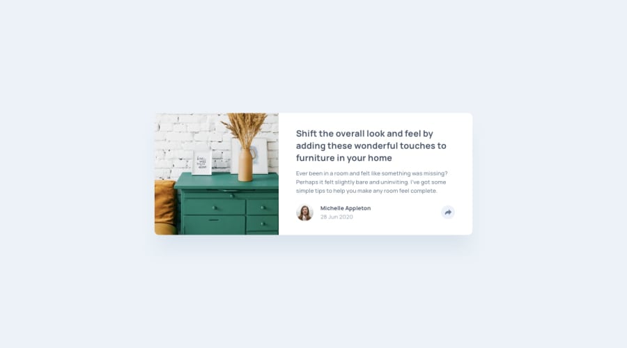
Design comparison
Community feedback
- @jgengo-altPosted over 2 years ago
Hello,
Everything looks so huge and I tend to believe it's because the text has a font-weight 700 ; If you give the description text a font-weight 500, it looks way better
Regarding your desktop version for the text "share" would have been better inside a <p> or <span> element.
Also some letter-spacing and a smaller font-size would give a better impression. You can test by adding this to your .share class
letter-spacing: 0.5em;
font-size: 12px;
Also, adding some word spacing to the date can make it look softer as well:
word-spacing: 0.3emFor your JS part, I would suggest to try to add the repetitive things inside variables
So for example instead of re-evaluating:
document.getElementById("button")at multiple place, you can actually add it to a variable and reuse it like so:const button = document.getElementById("button") button.style.display = 'xxx'; button.addEventListener("click", init);and instead of using eventListener for click, on the button html you can add the attribute onClick="yourFunction()"
example:
<button class='btn btn--primary' onClick="init()">my button</button>Last detail, but not least, I suggest you try the chrome responsive dev tools, to try with different mobile settings you will notice that your front-end with mobile settings is a bit broken.
Except those details, that looks very good and you nailed the "share" tooltip responsiveness! Great job!
Don't hesitate to give me feedback on my version of this exercise as well ;)
Marked as helpful0
Please log in to post a comment
Log in with GitHubJoin our Discord community
Join thousands of Frontend Mentor community members taking the challenges, sharing resources, helping each other, and chatting about all things front-end!
Join our Discord
