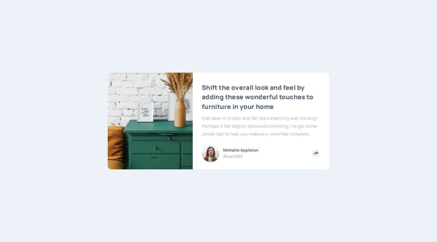
Article Proview Component built with HTML, CSS, JavaScript
Design comparison
Solution retrospective
I am happy the way the app turned out.
What challenges did you encounter, and how did you overcome them?The positioning of the social media overlay was very challenging.
What specific areas of your project would you like help with?I am happy to hear ANY feedback for improvement. Thank you in advance!
Community feedback
- @PabloodevPosted 5 months ago
Hi @codercreative, how are you? I loved your solution!
Here are some tips
-
Tidy up your github repository, I know that sometimes it seems boring, since we are always making solutions, why do I always tidy up the documentation and my folders? Speaking for myself, I always like to observe how organized the developer is with their code documents.
-
Your index is so cute, really good! (I know it's not a tip but positive feedback lol)
-
One thing I love to do after finishing my CSS styling and run the entire code with my eyes again and reduce redundancies, your code has more than 400 lines so maybe it would be cool to try to optimize your lines, this makes your lines more readable and with easy maintenance
-
The last thing is that maybe it would be cool to center the content in the center of the screen, when I open it in the browser it is half way up on the screen, giving the impression that it is undergoing maintenance, maybe it would be cool to align it using the flex display on your main content and align-items: center, but remember that the body needs to be at height: 100vh!
These are the tips I found, congratulations on your solution, keep it up Cris! ❤️❤️
Marked as helpful1@codercreativePosted 5 months agoThank you so much @Pabloodev for your very helpful feedback! ❤️🙏 I have updated my project so that is centered on the page. Yes, absolutely, I have to update my github repo...it is on my to do list. All the best☀️ Christina
0 -
- @thomashertogPosted 5 months ago
Your card is way bigger than the intended design. Though no pixel-perfect match is required, this feels a bit too astray from the original challenge
Your HTML feels a little awkwardly structured. e.g. no <h1> present which I can understand since it's only a component and not a full page, however remember to include one if you're building full pages. You may also want to remove the alt text (and add aria-hidden) for the icons, since they are purely decorative (and properly labeled through their parent/container)
For future reference it may be easier/more practical to have your reset styles in a separate stylesheet you can also look into the
gap
-property for the social icons instead of using margins on them Because of the way you implemented that share section (including a different button to get back), there is a slight difference in positioning of that button making it jump from one position to the other when toggled.I can't put my finger on it and say what exactly should be refactored, but I feel you've written a lot of CSS code where a simpler solution is available. Selectors feel more complex than they should as well. There are also some duplicate declarations (e.g.
display:flex
within the.contact-section
selector)Keep learning, keep improving!
Marked as helpful0@codercreativePosted 5 months agoHi @thomashertog. Thank you so much for taking the time to review my code! I will go back and fine-tune the app.
0
Please log in to post a comment
Log in with GitHubJoin our Discord community
Join thousands of Frontend Mentor community members taking the challenges, sharing resources, helping each other, and chatting about all things front-end!
Join our Discord