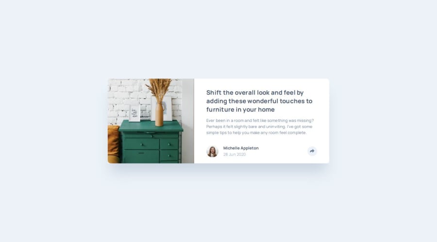
Design comparison
Solution retrospective
I'm glad i managed to get the javascript working, it was more tricky than I imagined with the design on the mobile side which wasn't a simple change in styles.
I would've perhaps planned a little more the different states and including the css upfront and toggling instead of creating the html and some of the css using js. The flexibility of js allows for this and is harder to refrain from using it.
I only found out at the end that i should've perhaps used utility classes and toggling classes on and off elements instead of styling individually.
What challenges did you encounter, and how did you overcome them?Getting the mobile view javascript to work with the design. I eventually got there by restarting the javascript again from scratch and refactoring a little bit at a time as it started to grow.
What specific areas of your project would you like help with?HTML semantics CSS structure and responsiveness JS structure, syntax and overall approach to animation.
Community feedback
- @delrio12Posted 10 months ago
The layout looks great! You managed to keep the range of sizes. Awesome attention to detail, your solution has the correct fonts, style and size range. The code is readable and well-structured.
0
Please log in to post a comment
Log in with GitHubJoin our Discord community
Join thousands of Frontend Mentor community members taking the challenges, sharing resources, helping each other, and chatting about all things front-end!
Join our Discord
