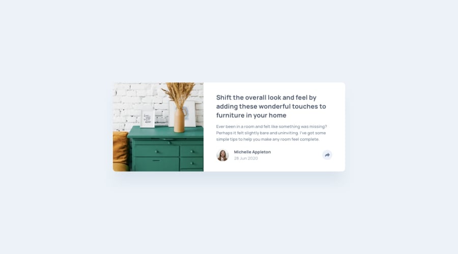
Design comparison
Solution retrospective
This one was quite more challenging for me as the previous ones, not only because it had some JS in it, but also because I wasn't very clear on absolute and relative positioning in css.
I think it turned out quite ok, but it still has issues (svg arrow on share button, width of the image changing depending on the browser...)
I would definitely think more about how my css and js will interact next time to avoid spending a lot of time fixing responsive issues.
What specific areas of your project would you like help with?- Positioning in css : I'm still not very satisfied with my solution for handling the share component in desktop view. Is there a way to position it according to the center of the button without making it a child of the button ?
- Width of my image is not the same on Chrome and Firefox... How is that so and how can I make sure it stays coherent ?
- Adding the arrow on css : I like the result, but am not very sure of how it works exactly
- This SVG drove me nuts : how do you change its color and keep it in a separate file ? Fill attribute didn't work for me...
Join our Discord community
Join thousands of Frontend Mentor community members taking the challenges, sharing resources, helping each other, and chatting about all things front-end!
Join our Discord
