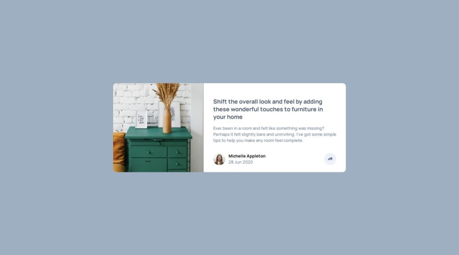
Design comparison
Solution retrospective
I learned how to do DOM in js
What specific areas of your project would you like help with?i need some help to make that triangle shape thing in the middle of the link section
Community feedback
- @moonji-spoonjiPosted 7 months ago
Oh wow, great job! Your solution looks almost identical to the design! The main differences I noticed are the background color (should be --Light--Grayish--Blue), the image is shown in full instead of mainly the left and center parts), and the padding of the content is not equal on all sides.
I wasn't able to make the speech bubble type of thing either unfortunately, but here's a link to something I tried. Maybe you can make it work!
0@moonji-spoonjiPosted 6 months agoSure thing, I hope it works out for you! @Sandaruwan7056
0
Please log in to post a comment
Log in with GitHubJoin our Discord community
Join thousands of Frontend Mentor community members taking the challenges, sharing resources, helping each other, and chatting about all things front-end!
Join our Discord
