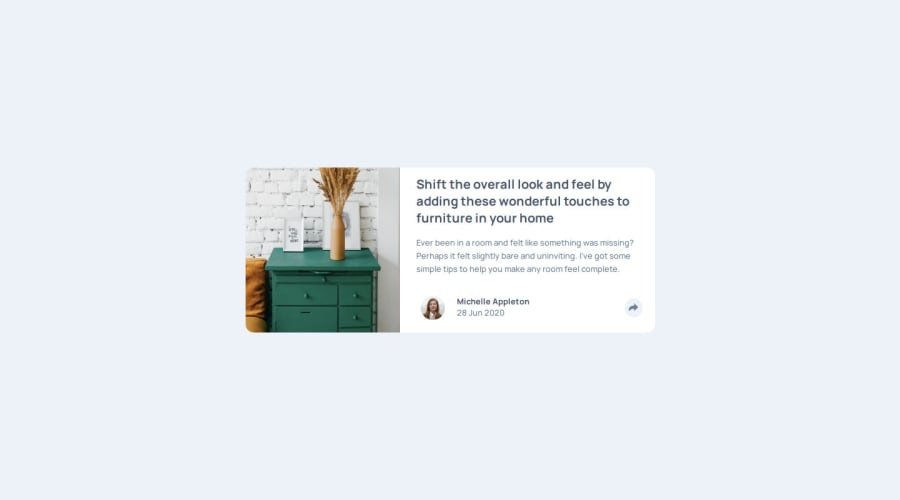
ARTICLE PREVIEW USING HTML CSS AND JAVASCRIPT
Design comparison
Solution retrospective
I am proud to have started learning javascript, and I am progressing really well
What challenges did you encounter, and how did you overcome them?I am proud to be able to easily handle mobile-first workflow, which was evidently something I had a problem with as stated in my previous solutions. In addition, I was able to use media queries to make my website responsive and smooth.
What specific areas of your project would you like help with?I haven't been able to position the share icon links above the button in the desktop design. I would really like help with that. I feel I could be overlooking something very basic yet fundamental.
Community feedback
- P@peter4049Posted 10 months ago
The solution includes semantic HTML which is everything under <main> and then broken down by <div> and <section> so the code is clean and helps to understand others. There is no need to make improvements because it's all good. The code is well-structured and clean. The design does not differ from the main design. It's helpful for me to look at Peer review of other people's codes because I learn a lot from that.
Marked as helpful0
Please log in to post a comment
Log in with GitHubJoin our Discord community
Join thousands of Frontend Mentor community members taking the challenges, sharing resources, helping each other, and chatting about all things front-end!
Join our Discord
