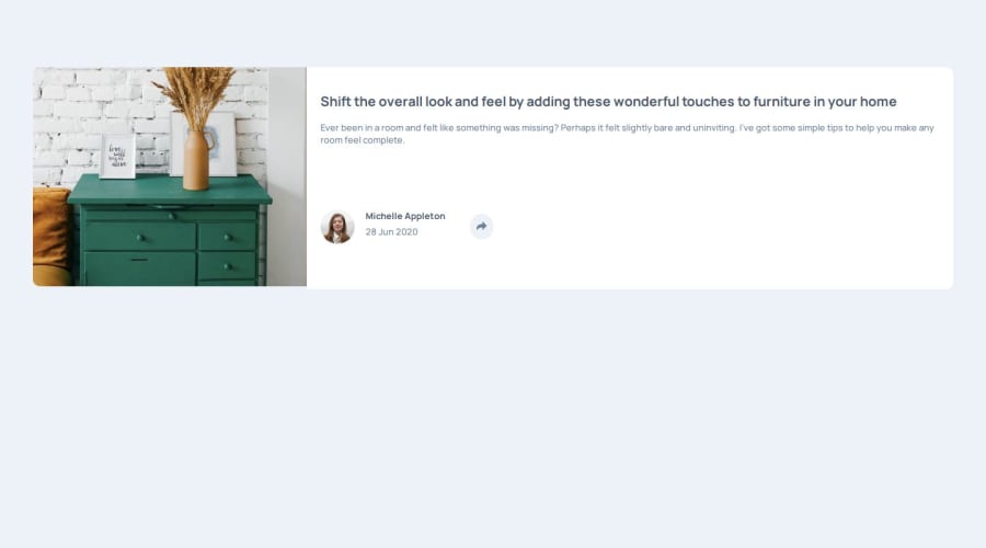
Design comparison
Solution retrospective
The aspect of the footer, when dealing with the share icon being clicked, that is the hovered background in desktop-view only.
Community feedback
- P@aouintihouariPosted 6 months ago
Your code is well-structured, and you’ve made good use of HTML, CSS, and JavaScript to build a responsive component. Here are a few suggestions and improvements for best practices:
HTML: <info> tag: The <info> tag used inside the footer isn't a valid HTML5 tag. Instead, you can wrap the span and p elements inside a more appropriate tag like <div> or <article> depending on the semantic meaning you want to convey.
html
<div>
  <span class="bold-text">Michelle Appleton</span>
  <p class="new-text">28 Jun 2020</p>
</div>
Alt text improvements: The alt attributes should be more descriptive. Instead of just "drawers" or "avatar", it would be clearer to use something like "Close-up of wooden drawers" and "Avatar of Michelle Appleton".
Consider removing commented-out code: The attribution in the comment at the bottom can be removed unless you're planning to use it. Removing unnecessary comments will keep the code cleaner.
CSS: Use of @import in CSS: Loading Google Fonts via @import can delay the rendering of your CSS. It’s often better to include the font link directly in your HTML <head> for performance improvements:
<link href="https://fonts.googleapis.com/css2?family=Manrope:wght@200..800&display=swap" rel="stylesheet">Consistent rem or em usage: You’ve used rem for font-size, which is great, but try to also use rem or em for padding and margins. This ensures that your design scales properly when the user adjusts the root font size.
Example:
.few {
    padding: 1.25rem 3.25rem; /* instead of px */
}
DRY principle in CSS: The .hovering-footer and .sub-footer share many common styles. You can refactor to avoid repetition:
.footer-container {
    display: flex;
    flex-direction: row;
    padding: 20px;
    gap: 1rem;
}

.sub-footer, .hovering-footer {
    border-radius: 10px;
}
CSS for small devices: While your media queries target small screens (min-width: 300px and max-width: 760px), it might be better to start with mobile-first CSS by using min-width and allowing your styles to scale up. This can improve performance for mobile users.
JavaScript: Reduce direct innerHTML assignments: Directly modifying innerHTML can be a security risk (XSS vulnerabilities) and performance-heavy if there are many DOM elements. Instead of using innerHTML, consider using DOM manipulation methods like appendChild() or innerText.
Example:
function showHoveringFooter() {
    const hoveringFooter = document.createElement('div');
    hoveringFooter.classList.add('hovering-footer');
    hoveringFooter.innerHTML = `
        <h3 class="share-footer">SHARE</h3>
        <div class="hovering-icons">
            <a href="https://www.facebook.com" target="_blank"><img src="./images/icon-facebook.svg" alt="facebook"></a>
            <!-- Other icons -->
        </div>
    `;
    subFooter.appendChild(hoveringFooter);
}
Event listener on elements: You’re adding multiple event listeners to the share button whenever the footer changes. This can result in memory leaks or performance issues if the component is re-rendered frequently. Remove old event listeners before adding new ones:
document.getElementById('share-icon').removeEventListener('click', showHoveringFooter);Avoid redundant queries: Instead of calling document.getElementById('share-icon') twice (inside showSubFooter() and in the main function), store the reference in a variable:
const shareIcon = document.getElementById('share-icon');
shareIcon.addEventListener('click', showHoveringFooter);
General Suggestions: Accessibility (ARIA attributes): Consider adding ARIA attributes or roles to make your share button more accessible:
<button class="share-icon" id="share-icon" aria-label="Share this article">Image optimization: If not already optimized, consider using responsive image techniques (srcset, sizes) or compressed images for faster loading times.Favicon link: The type="image/png" and sizes="32x32" for the favicon link can be simplified to:
<link rel="icon" href="./images/favicon-32x32.png">Marked as helpful0 - @JimztechPosted 6 months ago
Thanks a lot, I would surely apply this in future projects, still trying to grab the inner workings of vanilla Js though. Thanks for going through my codebase and sorting the errors out, I am very much grateful.
1
Please log in to post a comment
Log in with GitHubJoin our Discord community
Join thousands of Frontend Mentor community members taking the challenges, sharing resources, helping each other, and chatting about all things front-end!
Join our Discord
