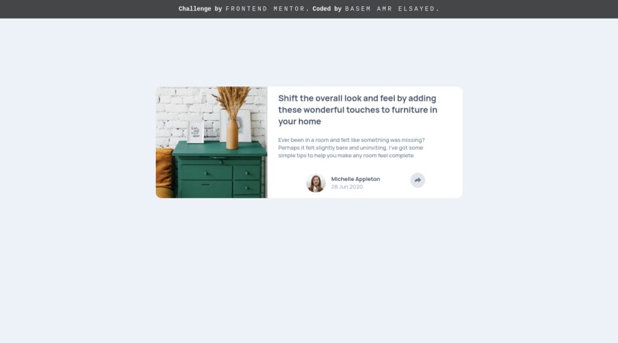
Design comparison
Solution retrospective
Feedback is very appreciated, thank you!
Community feedback
- @RioCantrePosted almost 3 years ago
Hello there! Awesome job with this one. Viewing your solution, I would suggest the following for you...
- Adjust the padding in the
.articlerule set intopadding: 1rem 3rem; - Adjust the properties in the
.writterinto this ...
.writter { max-width: 15rem; grid-area: writter; display: grid; grid-template-areas: "avatar name" "avatar artcl-date"; column-gap: 1rem; justify-self: start; align-self: center; }- Import the
attributionstyle in the CSS file and remove thestyletag
Hope this helps and Keep up the good work!
Marked as helpful1@BasemAmrPosted almost 3 years agoThank you for the feedback, @RioCantre ! for the
.witterdiv, I aligned it to end so it doesn't change its vertical position, which can lead on some devices to appear over the.share__linksdivand yeah it was really annoying so I set a maximum width for the
.cardmain element so its shape still goodalright, I've actually imported
attributionstyle in the main scss file but forgot to delete its styling fromindex.htmlthanks again, happy coding :)
1 - Adjust the padding in the
Please log in to post a comment
Log in with GitHubJoin our Discord community
Join thousands of Frontend Mentor community members taking the challenges, sharing resources, helping each other, and chatting about all things front-end!
Join our Discord
