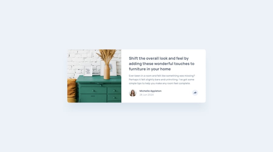
Design comparison
SolutionDesign
Solution retrospective
feedback welcome
Community feedback
- @retr0webPosted 11 months ago
Hi mypetonthenet!
A little tip on how to make a triangle below the share box (as it was shown in the design of active state), you can use ::after for the box with property clip-path.
That should make the triangle:
.share-box::after {
  content: '';
  position: absolute;
  clip-path: polygon(100% 0px, 0px 0px, 50% 100%);
  width: 15px;
  height: 15px;
  bottom: -15px;
  background-color: (same as the box);
}
Hope that was something new and helpful!
Marked as helpful0
Please log in to post a comment
Log in with GitHubJoin our Discord community
Join thousands of Frontend Mentor community members taking the challenges, sharing resources, helping each other, and chatting about all things front-end!
Join our Discord
