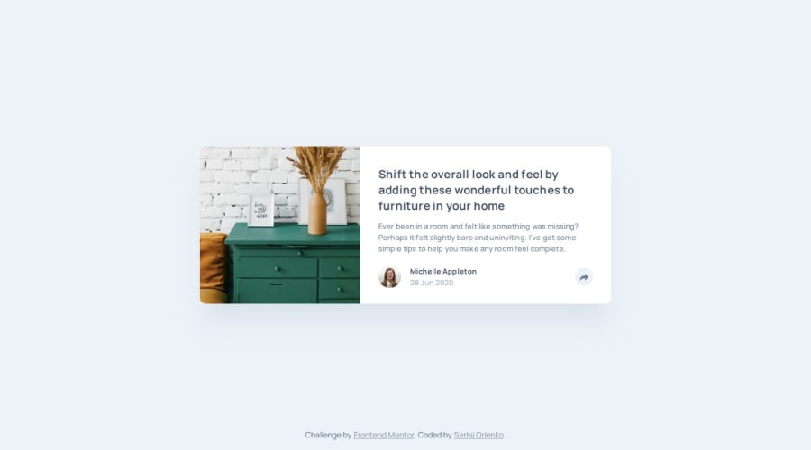
Article preview: HTML&CSS JS (very simple) mobile first
Design comparison
Solution retrospective
Hi! Am very happy! This challenge really help me! Please, leave a comment and suggestions for this small work. It very important to me. I want to be better :) Thanks for the yours time ;)
Community feedback
- @NeoScripterPosted 6 months ago
Perfect animation and layout! I like everything. One tiny thing I noticed is the button border on focus. It always stays blue after I click on it even when I remove the cursor. You might wanna use 'focus-visible' instead of 'focus' property.
Marked as helpful1P@grifanoPosted 6 months ago@NeoScripter Thank you, Ilya, this is great tips, I was looking for this to fix focus 🙏 Now I use it for next challenge with Newsletter-form 💪
0 - P@MikDra1Posted 6 months ago
WOW! You've done really well.
One thing that could be changed is the media query. When the size of viewport is less then 880px the socials that are in the pop up are cut off. To repair it I would try to simply add the media query a little bit earlier. Expect that really good work 😉😀
Hope you found this comment helpful 💗💗💗
Good job and keep going 😁😊😉
Marked as helpful1
Please log in to post a comment
Log in with GitHubJoin our Discord community
Join thousands of Frontend Mentor community members taking the challenges, sharing resources, helping each other, and chatting about all things front-end!
Join our Discord
