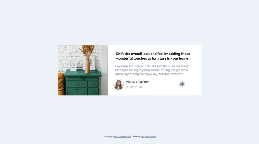
Design comparison
Solution retrospective
I actually search for different share buttons and see so much stuff there!
What challenges did you encounter, and how did you overcome them?I find it very very very difficult to make that share button responsive because I set it to {position: absolute;} so when I changed the screen size, it would stay in that place which I already set it to. That was very hard. I hope in the future I do better!
What specific areas of your project would you like help with?make that share button more responsive!
Community feedback
- @KapteynUniversePosted 5 days ago
Hey Daniyal Abbassi Khervi, you have an interesting name. Looks part european, part arabic and part indian.
You don't need to set height very most of the times. That is breaking your container below 500px, and also because you added overflow hidden, share-container becoming invisible. So remove
height: 70vh;
andheight: 280px;
from #container.Plus to that; avoid using hard coded values like
width: 800px;
, this is breaking responsiveness. Usemax-width: 800px;
instead. For better responsiveness using max-width: 50rem; would be better. Use rem especially for font size and media queries. This video might give you an idea about rem units.width: 95vw;
is kinda ok for what you want to do but after these changes you don't gonna need it.margin: 0 auto;
means top-bottom is 0 and left-right is auto. But you also added margin top and bottom after that, so 0 doesn't work. Not much of a problem but you can usemargin-inline:auto;
andmargin-block:250 or 220px
for what you did. Inline means left-right, block means top-bottom.You can use flex or grid for centering the container. You can check css tricks for the flex and grid
body { background-color: hsl(210, 46%, 95%); font-family: 'Manrope'; display: flex; flex-direction: column; /* It is row by default, i changed it to column because there is also footer */ justify-content: center; /* vertical center for column direction */ align-items: center; /* horizontal center or column direction */ min-height: 100vh; /* giving a height value to align items vertically */ }
#container { max-width: 50rem; background-color: white; border-radius: 10px; }
/* I removed all of this */ @media screen and (max-width: 550px) { #container { /* width: 95vw; */ /* height: 70vh; */ /* margin: 0 auto; */ /* margin-top: 150px; */ /* margin-bottom: 150px; */ } }
@media screen and (max-width: 550px) and (min-width: 300px)
also is ok but you can just write the css and use@media screen and (min-width: 550px)
and change the layout after 550px or@media screen and (max-width: 550px)
and limit the layout to 550px. Starting mobile layout and changing to desktop with min width usually better.Position absolute is a tricky one but you need to put active-share into the share container and give position: relative to the share container so you can position the share container relative to that. This broke JS on my side so you might need to rewrite JS.
Again using flex or grid for container instead of float might be better. I can't give you an example because it requires a lot of changing the code but imagine every part as a lego block. Container is a block, image and right text section is a block inside container, share container is a block inside text section and user name and date is a block inside share container so trying to style something like this might be easier:
<body> <main> /* I will come to this */ <article class="container"> * I will come to this */ <img src="..." alt="..."> <div class="text container"> <h2>..</h2> * I will come to this */ <p class="paragraph">...</p> <div class="share-container"> <img src="..." alt="..."> <div class="name-date"> <p class="name">...</p> <p class="date">...</p> </div class="name-date"> * name-date div end */ <button></button> * outside of name-date inside of share container*/ <div class="active-share"></div> * inside the share container */ </div> * share container div end */ </div> * text container div end */ </article> </main> </body>
Like this you can easly use flex or grid and change layout after 550px. Also you can use gap with flex or grid so you don't have to use margin for every element.
Now to other things:
It's important to make sure that your website is accessible to all users, including those using assistive technologies such as screen readers.
Landmarks, (or this page) are essencial for accesibility. Every page needs one main. Wrapping your container div or changing the div with a main would be good. Since this would be a single element around others and not the whole content of a real page, wrapping might be better.
You can change container div with article tag aswell.
Do not skip headings and also don't use them for sizes, you can always style them. But this component is for to use in a web page and every page should only have one h1. This is a simple card, it would never be used to serve the main heading on a page, so your h3 using kinda ok but felt like you used it for the size.
Use classes instead of ids for styling. Ids have higher priority and should be unique to one element so you can't use same style for different elements.
I also recommend you to use a modern css reset or Andy Bell's reset for every project.
Lastly image alt texts needs to be meaningful, unless decorative. It is for the screen reader users, also to show if image failed to load. So drawer needs more content if you think it is not decorative.
1 - @Djamel1133Posted 5 days ago
Hi, good job on tackling this tricky challenge.
There is always room for improvement, even for expert developers:
-
Using HTML semantic tags like
<main>
is important. Also, using heading elements (<h1>
,<h2>
, etc.) in the correct order without skipping one ensures a better content hierarchy. -
Using relative units (
rem
,em
,%
, etc.) instead of absolute ones can guarantee better responsiveness and more flexibility. You can read more about relative units here.
Keep up the excellent work and happy coding!
0 -
Please log in to post a comment
Log in with GitHubJoin our Discord community
Join thousands of Frontend Mentor community members taking the challenges, sharing resources, helping each other, and chatting about all things front-end!
Join our Discord