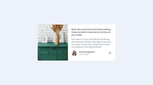
Design comparison
Solution retrospective
This is my first time using JS in my code. I used to study it, but I never used it in real projects.
What challenges did you encounter, and how did you overcome them?I faced many problems in my code first the responsive design, second JS actions on the buttons, it took days to finish it. I fed up many times, but Al-hammdullah I searched more and more until I managed to set the solution.
What specific areas of your project would you like help with?Java event listener and setting the best HTML structure to get it easily using JavaScript. more than this How to arrange my steps, I mean I asked myself many questions while I doing it like: Shall I start with the mobile screen or desktop one, How can I do the active button, where to put it, How I will change it in the other screen. It was a hard one for me.
Community feedback
- @Grimm-NPosted 3 days ago
Amazing work! 🤩 You’re doing a fantastic job, and I can see how much effort you’ve put into this. Keep it up! 🎉 Here are a few tips that might help you refine your design and code:
-
Mobile-first approach – Every beginner struggles with the decision: should I design for desktop first or mobile? I’ve been there too! 😅 The general recommendation is to start with mobile-first design. Why? Because it’s easier to scale up for larger screens and you’ll end up writing fewer media queries overall.
-
**Place your `` tag. This ensures the HTML content loads first, preventing delays in rendering. This approach also improves user experience and reduces page load issues.
-
Group elements appropriately – Instead of using
<article>
for grouping, consider using semantic tags like<section>
or<div>
(if it doesn’t require semantic meaning). Articles are generally intended for standalone content like blog posts or news items. Using appropriate tags keeps your code clean and meaningful. -
Avoid using pixels everywhere – Instead of
px
, use responsive units likerem
,em
, or percentages. These units adapt better to user settings and different screen sizes, ensuring a more flexible and accessible layout. Pixels are fixed and can make your design less user-friendly on various devices. -
Remember 320px screens – While most devices have larger screens nowadays, 320px-wide displays still exist. To ensure your design works well on smaller screens, you can set the width of cards to
90%
or90vw
. This prevents cards from sticking to the edges of the screen and gives a cleaner, more balanced layout.
Keep up the awesome work! 💪 The more you experiment, the faster you’ll grow as a developer. 🌟
Marked as helpful1 -
Please log in to post a comment
Log in with GitHubJoin our Discord community
Join thousands of Frontend Mentor community members taking the challenges, sharing resources, helping each other, and chatting about all things front-end!
Join our Discord