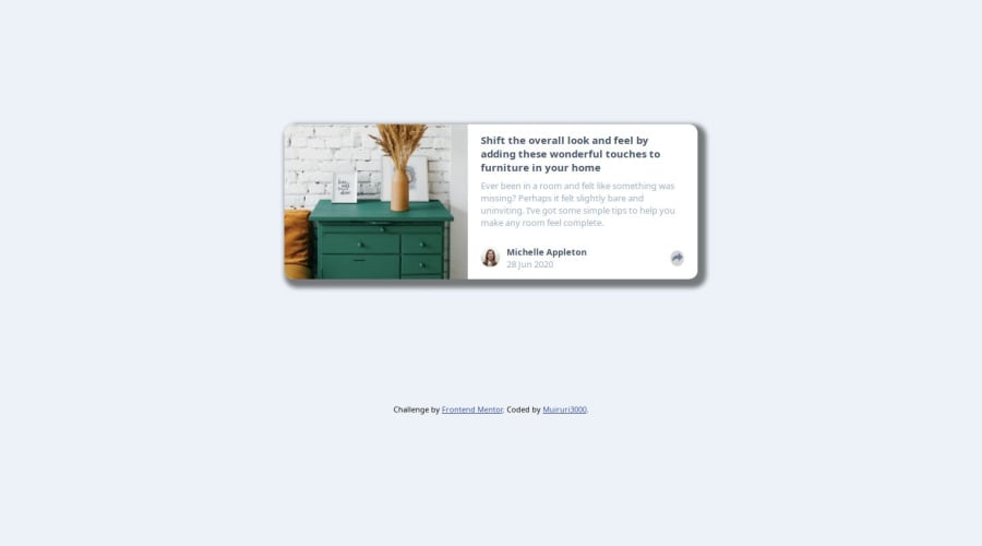


Design comparison
SolutionDesign

Solution retrospective
What are you most proud of, and what would you do differently next time?
one more output,
What challenges did you encounter, and how did you overcome them?share icon was not visible, used ::before and background-image.
What specific areas of your project would you like help with?positioning of elements is a challenge, and having them in proper place at different viewpoints.
Community feedback
- @Dzinpa1Posted 4 months ago
Kindly pay attention to the original design to get a similar look. For the more apparent areas of improvement;
Maintain the default font-weight of "card-content--title" Reduce the sharpness of the box-shadow around the card
0

Please log in to post a comment
Log in with GitHubJoin our Discord community
Join thousands of Frontend Mentor community members taking the challenges, sharing resources, helping each other, and chatting about all things front-end!
Join our Discord