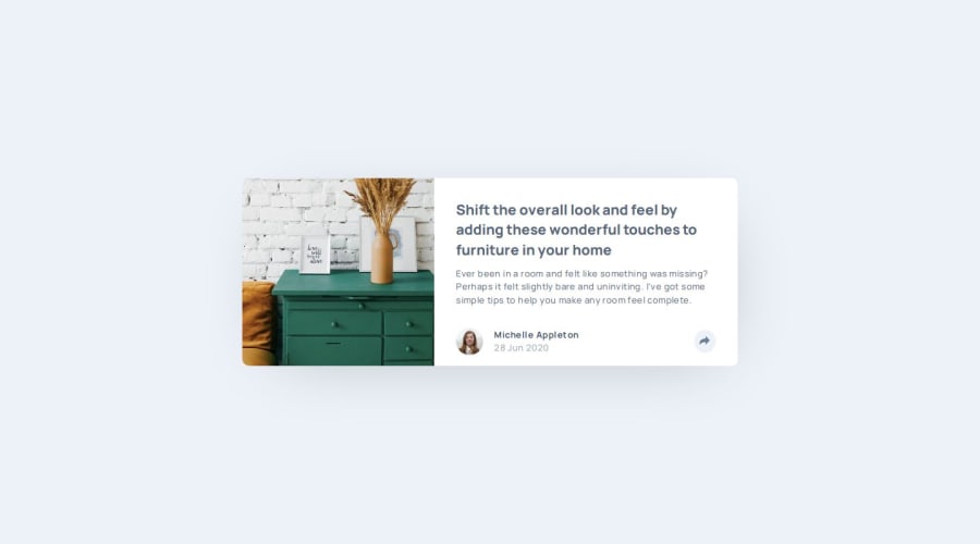
Article Preview (Dialog HTML elem & abs positioning + JS for events)


Design comparison

Solution retrospective
I am proud of keeping an open-minded, exploratory approach at all times, instead of rushing through to just submit it. I reminded myself at every time that the point of what I'm doing here is to challenge myself and learn more, not just to get things done in the fastest and easiest possible way. I don't think I would change anything for the next time (I will just have gained experience and some good knowledge and understanding of a few things, though). :)
What challenges did you encounter, and how did you overcome them?Plenty! When I first looked at it, I said " Oh, that's too easy!'. I will have to take that one back. But I'm glad I faced challenges, because that's the point of doing this. And because that's how I'm learning so much more every single day.
I can't comment every challenge and everything I learned as it was really a lot. But I'll try to summarize and mention some of the most relevant.
By far the biggest challenge I faced was the positioning of the popup (at the footer on mobile, and yet above the button -and pointing towards it- on larger screens). I overcame it, as always, by reading a lot :D and experimenting with what I study. This resulted in attempting many approaches, two of which stuck: a) the one in the URLs above, which uses absolute positioning and a dialog box (and then JS for the events) and b) the other one (repo here and live URL here) which uses no JS, only the popover API (HTML & CSS) and the newer anchor positioning (CSS). Unfortunately, the latter approach is more buggy in terms of positioning the dialog box (try opening it and resizing the screen in the y-axis/vertically and see how the whole thing moves except for the dialog box), but except for that, it worked and I learned a lot with both, so I decided to keep it anyway. (Also, features only supported/implemented on Chromium, non-iOS browsers, but even then with the bug mentioned).
Another challenge (which also taught me a lot) was trying to animate, or I should say transition the fade in and out of the dialog box. I learned not only about allow-discrete but also about @starting-style among other things.
Though I couldn't apply it here due to other reasons, I learned that sometimes instead of specifying different border-radius per each corner of a card's children, you can just specify the one border-radius desired in the parent and then make it overflow: hidden. It works and you don't need to dictate every single border-radius. Can't apply it in this scenario though because I need the dialog box to overflow the card.
Learned that you can alter some svg attributes from css. OK, I knew some, but I changed the fill in the svg through a transition and I liked that. (I'll have to keep digging on how many other svg things you can do like that!).
Learned that you can use decimals with the fr unit of grid. What? Didn't know (or expect) that!
Learned that with replaced elements, grid sometimes just work better. OK, I still want to research more on using images in flex, but it feels like grid just make it easier sometimes (OK, maybe I'll change my mind in the future).
There's many more challenges and lessons learned, but I can't fit them all here. :)
Also, huge credits and thanks to @Grace-Snow on FEM's Discord, who helped me through my stress over the quirks using Popover API and Anchor Positioning, and at least as importantly, gave me a lot of great tips on accessibility (yeah, learned those, too!).
Personally, best project so far. Really tested me and my resolve, too. :)
What specific areas of your project would you like help with?As always, any advice from more experienced people can only help and is prone to be very thanked for.
However, the one that I would appreciate the most is, if at all possible, anyone with experience were to have a look at the second set of URLs (the ones in my previous response above) and figure out where I lost my path to make that popover + anchor positioning thing work as it should. What did I misunderstand about them?
If you're such a good soul, what you have to do to test this is:
- open in a Chromium browser (Chrome, Edge, etc) in a non-iOS system (mobile or desktop doesn't matter).
- now, open the popup (by clicking -or focusing and pressing enter- on the share button). It may be that the first time it appears perfectly in place. If so:
- try to resize the height/vertical/y-axis of your screen (whether using responsive mode of dev tools or simply the browser window itself). If you reached until here, thank you! Please tell me if you happen to understand where I lost my path, and why the dialog box positions itself weird like that (as if it remained fixed, even though it's absolute and anchored).
Community feedback
Please log in to post a comment
Log in with GitHubJoin our Discord community
Join thousands of Frontend Mentor community members taking the challenges, sharing resources, helping each other, and chatting about all things front-end!
Join our Discord