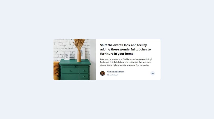
Article Preview Container built in React with click functionality
Design comparison
Solution retrospective
..
What challenges did you encounter, and how did you overcome them?..
What specific areas of your project would you like help with?I need help drawing downward arrow when we click on share button. I have found the solution using border-bottom but don't want to use it. If anyone knows different method to achieve this, greatly appreciated.
Community feedback
- @1deadjoePosted 11 months ago
This is a great job you've done. Congratulations. I'm impressed you were able to handle positioning the share links above the button, and I am learning from you. However, the typography is not what was indicated in the guide. As much as it is not mandatory to follow it, I would suggest trying out different styles and colors to find one that suits the tone and audience of the intended message. Other than that, good job.
1
Please log in to post a comment
Log in with GitHubJoin our Discord community
Join thousands of Frontend Mentor community members taking the challenges, sharing resources, helping each other, and chatting about all things front-end!
Join our Discord
