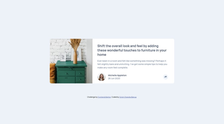
Article Preview Component with share icon


Design comparison

Solution retrospective
How can i make it responsive for all devices. This site is responsive for only desktop and smartphones. But looks weird in ipad display. Also you need to double click on the share icon to close the share apps. How can i hide it in one click ?
Community feedback
- @amalkarimPosted about 2 years ago
Hi Girish,
I think the problem is caused by this styling
margin: 15.625rem 20rem 5rem;on.containerclass. If we reduce the browser width, the margins are not changing, but the width of the content is changing drastically. You can remove that styling, and usewidthormax-widthinstead. Create another media query breakpoint to accomodate the iPad or tablet display. Also, give the image this style:object-fit: cover;to avoid the image being squeezed at any given width.To show and hide the share window in one click, first change line 45 and 68 in
index.htmlto this<button class="share-icon" onclick="toggleDisplay()">We want it to be concise, so let's just stick with one function instead of two. Below is the script for function
toggleDisplay(). Use them to replace the existing script.const share = document.querySelector(".inactive"); function toggleDisplay() { if (share.style.display == "flex") { share.style.display = "none"; } else { share.style.display = "flex"; } }There's a lot of other improvements that we can do for this particular challenge. But for now, I hope this few advice could help you in some way.
Happy coding!
Marked as helpful0@GirishbanuaPosted about 2 years ago@amalkarim thankyou so so much for the advices and corrections, would love to hear more from you.
0

Please log in to post a comment
Log in with GitHub
Join our Discord community
Join thousands of Frontend Mentor community members taking the challenges, sharing resources, helping each other, and chatting about all things front-end!
Join our Discord