Submitted over 2 years ago
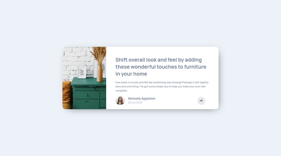
Article preview component with share button - HTML, CSS, JS
@jdpaige
Design comparison
SolutionDesign
Solution retrospective
Areas of difficulty:
- Simply landing on an approach to arranging the html. I started over entirely at least twice, realizing how I would need to arrange things to position the social popup correctly.
- I wish I could have come up with a better solution for the button, rather than two entirely different buttons.
- Being a bit inexperienced with CSS animations and transforms, I struggled with out exactly to make the popup, but using scale seemed to work well enough.
- Lastly, these projects are starting to get large enough that I can see the benefit to using something like Sass to keep my code organized.
Community feedback
Please log in to post a comment
Log in with GitHubJoin our Discord community
Join thousands of Frontend Mentor community members taking the challenges, sharing resources, helping each other, and chatting about all things front-end!
Join our Discord
