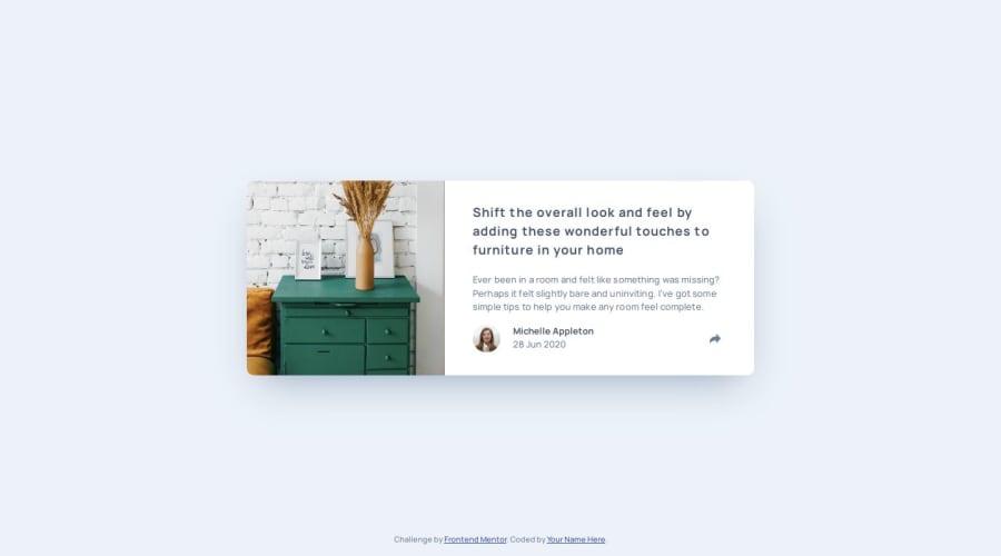
Design comparison
SolutionDesign
Solution retrospective
What specific areas of your project would you like help with?
if you have any tips, recommendations or corrections about my solution I would be very grateful.
Community feedback
- @Devs-advocatePosted 6 months ago
Really good job. Fonts, colors, text alignment are virtually identical. I used cropped images from the original jpeg to try and get what they were looking for.
0
Please log in to post a comment
Log in with GitHubJoin our Discord community
Join thousands of Frontend Mentor community members taking the challenges, sharing resources, helping each other, and chatting about all things front-end!
Join our Discord
