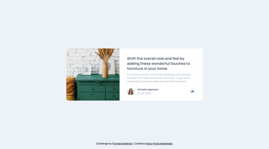
Article Preview Component With ReactJS, Styled-Componenets
Design comparison
Community feedback
- @Charlie025xPosted over 3 years ago
Nice solution, the animation was a nice touch too! I also posted my solution using react. After a quick glance at your code I noticed you styled your components within the .jsx files (where I made a separate scss (css) file, and linked it to it's corresponding .jsx component).
Do you write your styles in the .jsx because that's how you're learning react, or is there advantage to writing styles in this way? Just curious.
Another question, why do your class names look weird. I think they look generated, is that because of a dependency you are using or something?
0@rizky-pmPosted over 3 years ago@Charlie025x Thanks for your feedback, honestly this is not my best solution:) The tooltip animation only on mobile view, there's something blocked me to add animation on desktop view. And some layout not 100% accurate with the master design.
Yeah i wrote styles inside .jsx files because i used styled-components library, basicly it helps you to write css in javascript.
My class names look weird because its been generated by styled-components library, there's some thread to make the class names easy to read in debug tool, but i've not try it yet.
0
Please log in to post a comment
Log in with GitHubJoin our Discord community
Join thousands of Frontend Mentor community members taking the challenges, sharing resources, helping each other, and chatting about all things front-end!
Join our Discord
