Design comparison
Solution retrospective
Probably find a different way to handle the active states on desktop.
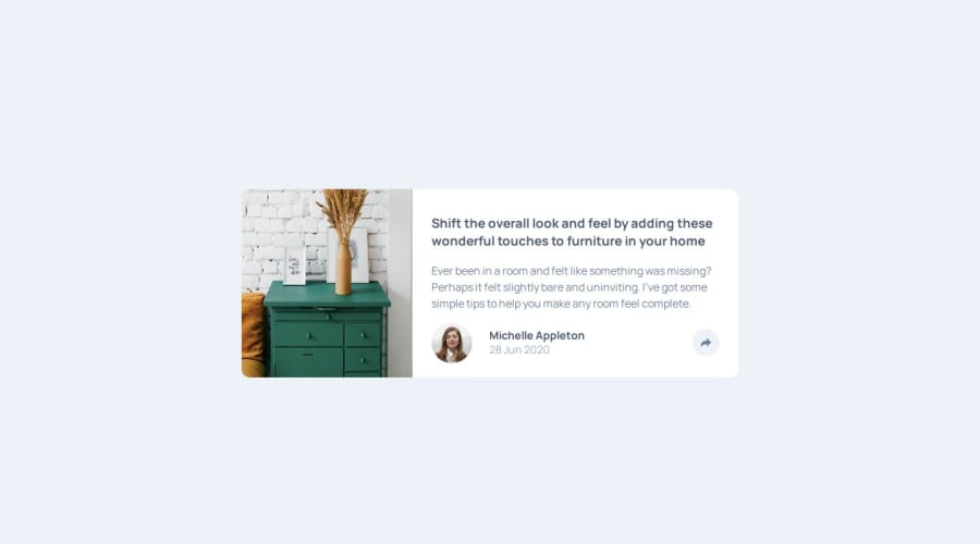
What challenges did you encounter, and how did you overcome them?the picture on the left on desktop does not look too good., how do i make it look like the design. i set the height to 100% and no width, or else it does not take all the container. What is it that should be done here ? I have not researched it as i thought it didnt look too bad
What specific areas of your project would you like help with?,the picture on the left on desktop does not look too good., how do i make it look like the design. i set the height to 100% and no width, or else it does not take all the container. What is it that should be done here ? I have not researched it as i thought it didnt look too bad
Community feedback
- @JohnPugh688Posted 12 months ago
Hi Makha,
Your project looks great!
I managed to get the image to work look more like the design by adding object-fit:cover and then object-position: left on the medium screen size only. this allows the image to scale to the size of the parent while also making the left side of the image be the main focus point so you will always see that side as you change between screen sizes.
hope this makes sense. I us Tailwind css so its slightly different for me but i think this should work for you. you may also need to set the width of the image to full (100%)
Theres so many different ways of achieving the same goal so its always fun to experiment.
Happy coding!
0
Please log in to post a comment
Log in with GitHubJoin our Discord community
Join thousands of Frontend Mentor community members taking the challenges, sharing resources, helping each other, and chatting about all things front-end!
Join our Discord
