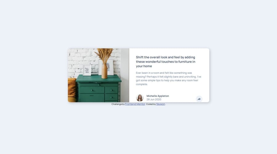


Design comparison

Solution retrospective
I'm proud that I kept going on this project, despite restarting it twice. I learned more about using the position property and custom CSS properties.
What challenges did you encounter, and how did you overcome them?I had trouble figuring out how to code the share button on mobile and desktop. I looked at tutorials on YouTube for help and also general tutorials on the position property.
What specific areas of your project would you like help with?I'm having trouble aligning the share button with the user pic and name/date on the bottom of the card, especially in mobile view. I'm guessing that it's because I coded the share-btn in a separate div from the info in my HTML?
As for desktop view: I'm stumped on why the bottom of the container is falling off in the generated screenshot. It looks normal on my desktop. I think it's because of how I used the margin to push everything down.

Join our Discord community
Join thousands of Frontend Mentor community members taking the challenges, sharing resources, helping each other, and chatting about all things front-end!
Join our Discord